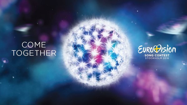
SVT has finally and officially revealed the Eurovision 2016 slogan. For this year’s edition they are asking us to “Come Together”. The slogan is a timely call for cooperation and understanding as a divided Europe struggles to find a unity over issues such as the ongoing migrant crisis.
The CEO of SVT made the point explicit in her opening remarks at the semi-final allocation draw. “When turbulence is high it’s even more vital to say welcome to all of Europe,” she said. “It has never, through the history of Eurovision, been more important to bring people together.”
Martin Osterdahl, the executive producer of Eurovision 2016, sees it as an extension of the “We Are One” slogan from Malmö: “It’s about reaching across all those boundaries that separate human beings from each other,” he said.
The actual logo — a dandelion — takes that idea further. It’s apparently a symbol of “resistance and resilience” as the flower can “break through bricks and mortar” and “when its seeds fly away, it creates new life where it lands.” If that doesn’t refer to migration, we don’t know what does.
The Swedish broadcaster revealed the news with a celebratory Tweet from its Melodifestivalen handle this morning, about 45 minutes before the semi-final allocation draw, which was scheduled to kick off at 11:15 CET in Stockholm City Hall.
Wohoo!! Här är logotypen för @Eurovision 2016. Vad tycker ni? ????? #eurovision #escse #esc2016 pic.twitter.com/84iyMoNDdD
— Melodifestivalen (@SVTmelfest) January 25, 2016
On Sunday evening rumours were swirling that SVT had gone with a Beatles-inspired slogan, leading many to the phrase “Come Together”. (It wasn’t going to be “Yellow Submarine,” was it?!). No word yet on whether the Beatles hit of the same name was in fact the inspiration behind this.
The slogan and theme artwork could be seen hanging everywhere this morning in Stockholm City Hall.
Mr. boss himself, Jan Ola Sand #eurovision #cometogether #stockholm #sweden
A photo posted by wiwibloggs (@wiwibloggs) on
We filmed the official “handing over of the keys” — from Vienna to Stockholm.
A video posted by wiwibloggs (@wiwibloggs) on


At first I thought SVT’s “Come Together” was a shot at the famous Beatles song, and the graphic was a representation of the Globe Arena. But after hearing the SVT CEO and Martin Osterdahl, I actually am taking a liking to it. As an American on the outside looking in, I think that the EBU and SVT are choosing to take a very diplomatic and welcoming stance in support of the refugee crisis. I thought both of their speeches took nice jabs at some of our unsavory presidential candidates who do not understand the importance of unity. They could learn… Read more »
“Come together” and the spreading of the seed? How much are these people paid to think it through?
Could we eventually go back to just the name of the competition and leave this logo and message bs all aside or totally scrapped out? Because I don’t see the point much less anybody taking this seriously … besides the whole “let’s love each other and be friends (except when juries’s votes overpower the televote)” is the biggest piece of rubbish and hypocrisy I’ve ever seen. Focus on the music for heaven’s sake … this is just insane distraction and so irrelevant. Oh lord … we’re really are becoming so Kardashian-framed … too much visuals, shallowness and distractions, much less… Read more »
‘Thank you for the music’ would have been more apt
Yes, I am also looking forward to Petra’s double entendres
Still think that is the Earth exploding after a nuclear war or something like that xDDD
Themes are getting more and more less poetic since 2012. Since 2013, the message is same. 🙁
The best one, I guess, was in Serbia, then Norway.
I never would have guessed that shiny white sphere is supposed to be a dandelion. It looks more like a newly discovered planet that resembled a disco ball so much they decided to name it Alcazar.
The slogan is okay, it’s not groundbraking or anything but at least it has some relevance in today’s Europeos and it’s not cringeworthy.
Cuming together? 😛
The logo reminded me of JESC as well, but it’s actually pretty nice. I didn’t recognize it as a dandelion at first tbh, but I like the explanation and meaning. I do hope as well, as someone already came up with this, that they will project it on the arena.
The slogan, however, leaves me cold. Very unoriginal and “simple”, nothing new at all. Of course it’s important to “come together”, as it’s the original idea of the contest, but still… way too bland.
Who doesn’t love a ball of crystal meth?!
I like it, I find it visually appealing, love the colors and the overall look. About the slogan: not original and very predictable, but it’s the general message of ESC about unity and harmony, so you can’t really blame them. I like it more than last year’s and even if it’s the same idea as JESC 2015 at least this one is better executed, hah!
to people who said thw slogans hav3 always been about peace you clearly have a bad memory it was Sweden that turned slogans into this political farce then Denmark made it no better and copied it. light your fire isn’t about peace at all. this logo wasn’t worth the wait i could put the same picture with we arr one. i could have the butterfly with come together. it looks like they usee a ditched draft from 2013
@Alex, U’re right, 2015 logo looked like JESC 2010 logo. Esc copies JESC and JESC copies ESC.
We will not wait that long until the contests get united(just kidding)
Feel your heart beat, Light your fire, We are one, Building Bridges … I think it’s safe to say that the ESC-tagline is and forever will be a bit cringy. I don’t know what people keep expecting. It’s not like we’re likely to see some spot on copywriting masterpiece like Nike’s tagline and logo. Besides, this is great. The goal of ESC has always been to cherish friendship beyond boarders, and that is implied here. But yes, I guess it would’ve been cool with a bolder move, something a lot more specific in the midst of this massive refugee crisis.… Read more »
The Swedish theme art is always dark and winterly. I would appreciate something warmer and brighter very much. Hoping to go to Spain next year. Olé!
Stop criticism now, please. JESC had a similar logo, but this is so much beautiful and brilliant, what’s the matter about both is based in the same thing? I think that logo is so original and well done.
It’s a total copy of Jesc 2015 and Jesc 2014
Haha, I do love a good double entendre. Graham Norton is going to have a field day with this slogan!!
Haters gonna hate. Bitterness and jealousy are one the main factors to why the world is a dark place nowadays. Stop fooling yourself.
Welcome back Sweden, we promise that this Eurovision will be unforgettable! No other country takes this contest more serious and we will do EVERYTHING to make this justice. No country in Europe can give as much
professionalism and passion for this competition as Sweden. We will rock you!
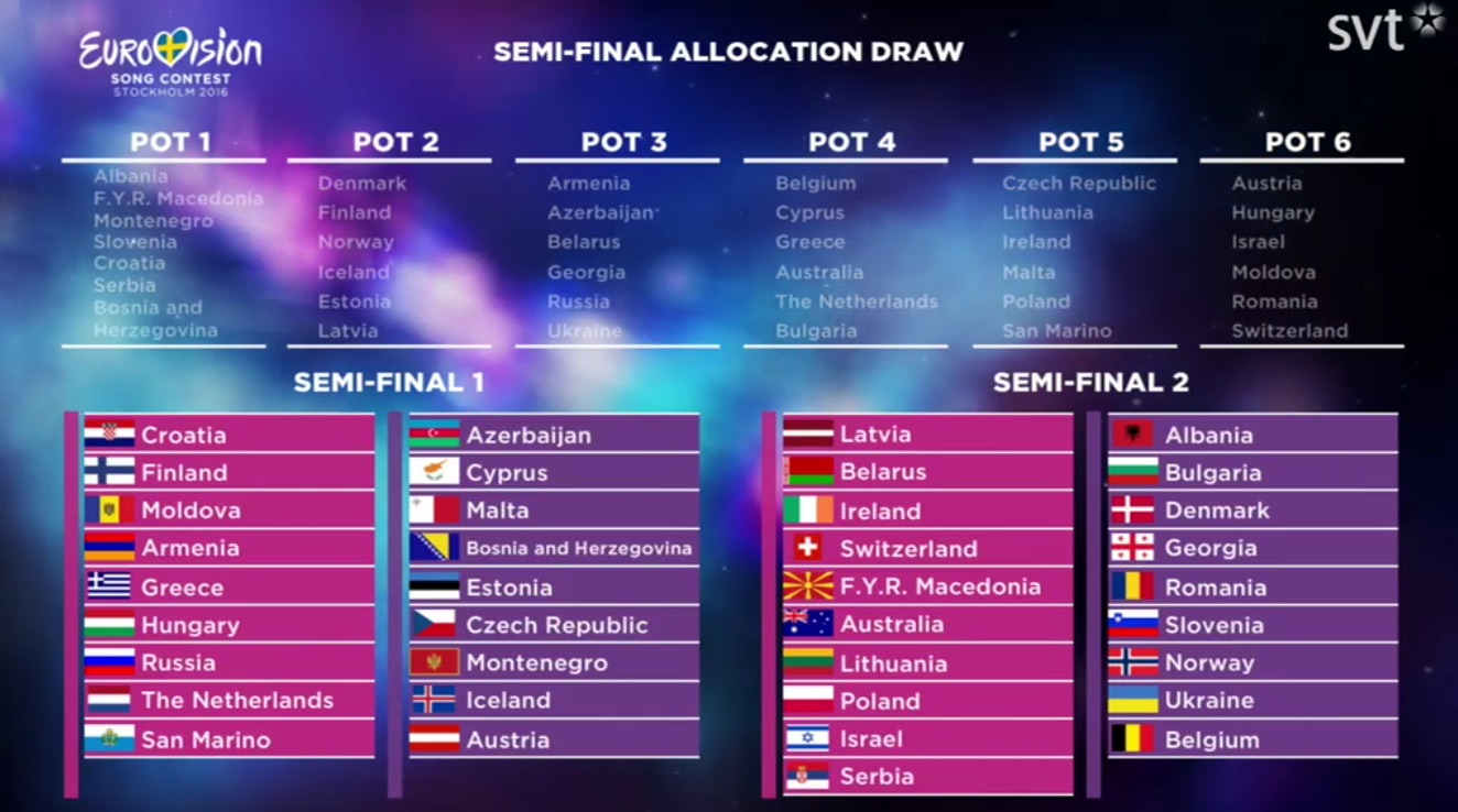
I wonder what is going to happen if all countries have requests about being in which semi final. I don’t understand why Germany always wants to vote in the second semi final. The big 5 are allocated in the same semi finals since 2014. What happens???
Come together, looool
Not convinced by the logo, but I love the theme and the motto! Their 2013 butterfly logo was a masterpiece, and I loved the way they used it in the postcards. Let’s see what they will do with this one… What is it btw? A dandelion?
Could this be a visual representation of the transitioning of JESC 2015 to ESC 2016? It could work but it makes me wanna ask why?
Wasn’t JESC 2015 over? No, wait…
Dont find it innovative or shocking. It is the same as other times but redone.
I hope the ESC is closer to 2000 than 2013 in design and concept. At least a great intro like in 2000
This name is basically jesc 2014 and logo jesc 2015. It’s still a nice logo but 2013 was better.
I loved the snow butterfly graphic they did in 2013, so I think this dandelion thingy is a great logo. A lot of possibilities for motion graphics. Plus it echoes the venue — the Globen. But that slogan? Did no one think of the children? :))
I loved the butterfly logo this one is underwhelming… It’s basicly jesc 2015 with another message.
I saw this coming!! It was sooooo predictable sweden would bring the refugee crisis into this xD
I can understand the slogan and like it. But I feel it would have been more suited if the UK was hosting it at the Echo Arena in Liverpool. Not Sweden at Globen in Stockholm. Overall it doesn’t have that much of the punch I would like at a Eurovision Logo. But I do like the colour scheme. @Denis The slogans are used all the time at the ESC, and well, if used correctly. In Dusseldorf, the “Feel your heart beat” slogan was used through out the show in all the postcards, and before each act you had the heart… Read more »
Something with the word “united” could’ve sounded less underwhelming and predictable tbh. I don’t mind the logo, but it could’ve been better.
That logo is really ugly. It looks like a dandelion. “Come together” isn’t a great slogan either. I don’t think the slogans have to promote world peace every year.
This is shaping to be one of the most dreadful ESCs ever. I mean, the logo…it’s kind of Viena 2015 & Sofia 2015 mashed up.
Where’s your originality Sweden? Oh, sorry, I forgot that you didn’t even win with an original song. My bad.
Esc 2015 and Jesc 2015 are having a cute baby ????
I really like this! Great job! There will always be people who are negative about everything -.- but oh well, great job Stockholm!
The play on word jokes started almost as soon as the slogan was revealed.
The logos have always been about peace, unity and similar. You can’t really avoid that since that’s the major point with Eurovision, to forget all troubles for one night and come together.And with the current negative outlook in a Europe where everyone is thinking about themselves and putting money in front of being helpful and seeing people as assets, the slogan is more than needed. It’s a statement, and where would Sweden be without making statements? That said, as I said below, do we really need slogans? No one takes notice of it anyway, and the shows aren’t built around… Read more »
So the logo is the disco ball from half the 2015 performances?
That logo couldn’t be better! Wow!
Great Logo, really bad slogan…
I love the logo, but the slogan is MORE OF A POLITICAL ONE. Why “Come Together” when you see now is a divided Europe over the migrant crisis, the fight against ISIS, and the upcoming in-out EU referendum for Britain?
SVT should change the slogan better to make it more Eurovision and not more political than it is!
I never understand the point of having logos at all. No one really takes that much notice of it anyway, and it’s not like the show itself works around it.
Jeez SVT it must have took all of 5 seconds to come up with that.
And dmeant ‘come together’ contradict their previous theme of ‘We are one’?
How can you come together if you’re already one?
Why don’t they come up with a decent less political theme like ‘Join our wave’ or ‘Party with us’ or ‘Different but the same’ maybe God forbid something Swedish like a logo that’s being pieced together (IKEA?)
I feel like they just get told what to say.
I hope they do something special with the logo during eurovision. Since it’s an orb, I hope they portray the flags during the show on globen. I loved that back in Baku 2012, but the crystal hall lights weren’t capable enough to portray the flags correctly.
The themes are always this kind of unity and peace and love crap. Well, not crap, but you know what I mean. At least this one has a musical heritage to it, so doing better than the themes for most years.
It reminded me instantly of JESC 2015. Overral I like the logo, just think the slogan could be more inspired but it’s fine
I actually really like this. Sweden always knows how to pull it off and of course every time people moan about it, but I think it will be much better than last year. 2013 in Malmö is my favourite Eurovision ever and I think they can outdo themselves! 🙂
Why have a slogan at all? When the EBU allows Russia, Belarus to compete what are we supposed to `come together` about? About attacking human rights, about dictatorships? It’s all a load of codswallop as we all know it would be the EBU’s worst nightmare if these countries won (however nice the contestants are).
this is too much copy of 2013