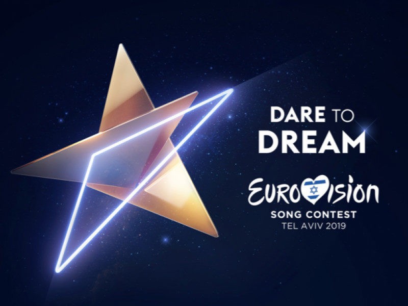
The triangle is a shape known to all of us from an early age. And, as the foundation of the Star of David, it also appears at synagogues, on Jewish tombstones and the flag of the State of Israel. Now it will also appear on the creative logo of the Eurovision Song Contest 2019 in Israel.
As the EBU explains, this year’s logo builds on the stunning Eurovision 2019 stage designed by Florian Wieder. The stage includes several triangular shapes and structures. Those rectilinear features come through in the logo, which sees three triangles come together.
Here’s how the official EBU-KAN press release describes it:
“The triangle, one of the world’s oldest shapes, is a cornerstone symbol found universally in art, music, cosmology and nature, representing connection and creativity. As the triangles join and combine, they become a new single entity reflecting the infinite stellar sky, as the stars of the future come together in Tel Aviv for the Eurovision Song Contest 2019.”
We are excited to unveil the inspirational Eurovision 2019 logo: three triangles that shine together to create a golden star! ?
The logo takes inspiration from Florian Wieder’s stage design, whose concept uses triangular shapes and structures. @Eurovision @kann @TelAviv pic.twitter.com/KQbSIy0hd6
— KAN Eurovision Israel ?? (@kaneurovision) January 8, 2019
There had been slight grumbling when Florian, a German, was picked to design the stage over local talent. That will now be muted somewhat, as the slogan and logo were created by two of Israel’s leading branding agencies — Awesome Tel Aviv, who developed the “Dare to Dream” slogan, and Studio Adam Feinberg (ST/AF), who developed the logo.
The Executive Supervisor of the Eurovision Song Contest, Jon Ola Sand, said: “We are delighted with the logo accompanying KAN’s slogan for Eurovision Song Contest 2019 — Dare to Dream — which perfectly complements the fantastic angular stage design created by Florian Wieder. We hope the creative theme for this year’s competition inspires the 42 contestants coming together in Tel Aviv in May, as they dream of becoming the stars of the future.”
As ever, the logo will be reproduced and adapted in several ways before and during the contest. The press release says it will be “displayed throughout the city of Tel Aviv in May” — presumably on billboards, banners and hangings. We wouldn’t mind seeing it on a coffee mug either.
Eurovision 2019 tickets
KAN has confirmed that Leaan is the ticket company for Eurovision Song Contest 2019.
That means the ticketing process will start sooner rather than later. The EBU says the first wave of tickets will go on sale after the semi-final draw, which Israeli media report will be on January 28th.
Eurovision 2019: The 42 participating countries
• Albania (RTSH)
• Armenia (AMPTV)
• Australia (SBS)*
• Austria (ORF)
• Azerbaijan (ICTIMAI TV)
• Belarus (BTRC)
• Belgium (RTBF)
• Croatia (HRT)
• Cyprus (CYBC)
• Czech Republic (CT)
• Denmark (DR)
• Estonia (ERR)
• Finland (YLE)
• France (FT)
• FYR Macedonia (MKRTV)
• Germany (ARD/NDR)
• Georgia (GPB)
• Greece (ERT)
• Hungary (MTVA)
• Iceland (RUV)
• Ireland (RTE)
• Israel (IPBC/KAN)
• Italy (RAI)
• Latvia (LTV)
• Lithuania (LRT)
• Malta (PBS)
• Moldova (TRM)
• Montenegro (RTCG)
• The Netherlands (AVROTROS)
• Norway (NRK)
• Poland (TVP)
• Portugal (RTP)
• Romania (TVR)
• Russia (RTR)
• San Marino (RTV)
• Serbia (RTS)
• Slovenia (RTVSLO)
• Spain (TVE)
• Sweden (SVT)
• Switzerland (SRG/SSR)
• Ukraine (UA:PBC)
• United Kingdom (BBC)
What do you think of the Eurovision 2019 slogan? Are you loving it? How does it compare to recent years for you? Let us know down below!


STUNNING!!!!!
Great work!
I love this logo! Simple, beautiful with a modern design! I’ve also seen the flags projected in the star and it looks amazing!
Thus is beyond cheap.
And guess what – Eurofans love it, because they adore cheap stuffs and trash music.
Oh, okay.
Exactly!
Anyone else getting 1 in 360 vibes?
why do they say it looks like the “Star of David”? it looks nothing like that Star of David, other that maybe hinting to it by having 2 triangles there…if anything, it resembles a Pentagram, or a pagan star…
2018 is vintage. 2019 is old-fashioned. Vintage is better than olf-fashioned…
None of them are vintage or old fashioned. Your understanding of design is very poor.
Last year’s host said themselves that they were inspired by mid-centrury designs for children illustrations and animations. This is a fact. Sorry. This year, it is quite obvious that the designs is reminescent of mid/late nineties / early 2000’s design, which in my opinion has still not reach a cult status. So, it’s plain old-fasioned. It seems that the ignorant is you, my dear.
Yes, 2018 logos has that mid-century feel, but the execution doesn’t scream vintage. Its ‘vintage’ is especially ruined by their color, unfortunately. I won’t say 2019 is not old-fashioned, but it’s not even late 90s. It’s a reminiscent of futuristic 80s look, which has a pretty big cult following, and it keeps on growing. Personally, 2019 is better than 2018, just because it’s more cohesive without giving too much ambition, and that it screams ‘music contest’ at the first look.
It’s true that the 2018 logos colors were brighter than the original mid-century inspiration, however the basis colour schemes used is still reminiscent of the late 60’s early 70’s designs in Portugal and Spain. As for 2019, I give you that. Indeed I am aware of the 80’s retro neon lights style. But for me they compromised too much and did not go the last mile down that road, which would indeed be more interesting. Anyway, thank you for a more uplifting and interesting reply that many in this particular post.
2018 was a vector logo that might be inspired by whatever, but the final product doesn’t look or feel vintage. It literally looks like thousands of logos that were created since the early 2000s. You’re a f*cking idiot.
I’m literally back to the USSR. How unfortunate. Israel doesn’t want me to forgot about this kind of star in my childhood everywhere, from pins to metro, school books, bridges and buildings,etc.
USSR doesn’t own stars
Rising Star 2.0
Well, why not?
Sorry but i don’t see anything special about this logo, is generic, outdated and kitsch and even a little bit cheesy… the video reminds me of 80’s “jem and the holograms” intro… sorry but, even it is better than last years’s, is still not a great logo,
I agree with you except that last year’s was much more creative and original and the logos were handmade true artistry, unlike this one computer generated that says a lot what this year will be like.
Um, the final logos of 2018 was computer-generated, soo…
No! The original designs were made on paper and painted. Then there were passed on to digital format. This makes all the difference.
And you waste your time replying to everyone
Ditto.
I don’t really care about these things, so I’m fine with it.
It’s beautiful. Not too much, not too little. Just good.
Looks like Birmingham 1998!
Hey, that was a good year for Israel
Yes! I knew it reminded me of another year…
At first, I found it basic and 80esque; then it started to grow on me. I look at the logo and it shouts “Made Of Stars” and “Golden Boy” to me. Besides, a star would almost never be a sad symbol … it’s the star that will guide us to May! I really like the sum of golden, neon and motion, by the way.
Illuminati confirmed
Definitely better than last year (actually anything would be better than last year), but not better than the logos from 2017 or 2016 – but who cares. As long as they organize a lit show that’s all that matters.
2017 was kinda weird but okay, 2016 was literally a disco ball, and I didn’t like it.
Last year was wonderful
The triangle actually looks like a map of Israel…
Absolutely briliant! Israel is keeping the “moving items” on stage and logo since 1979. In 1979- moving circles to create different shapes on stage. In 1999- moving sun beams to create different shapes on stage, and in 2019- moving triangles to create different shapes PLUS a moving logo. So nice to see they are keeping the traditional theme of moving shapes. Loving it!!!
Wasn’t the 1999 logo a slightly repurposed iteration of Birmingham’s the year before (which was shaped after the then generic Eurovision logo at the time)?
OK. So it’s a nice and effective design, but it isn’t really anything special or distinct. If I saw the logo by itself, without any text, I wouldn’t immediately relate it to anything, unlike logos from previous years.
Usually star-logos or neon-like elements are common in music contest logos, so there are noticeable connections, IMO. Well, I would recognize this more than logos from Oslo, Baku, Stockholm, Kyiv, or even Lisbon.
I understand I may be in the minority of the logo’s critics, and I will respect anyone else’s opinion, but the fact that it’s a star just feels even more clichéd and unoriginal. I must admit the execution and concept is beautiful, but I believe there have been better logos in the past – I enjoyed the Kyiv 2017 logo, for example, and found that one sleeker, more inventive (a contemporary take on the traditional necklace) and better overall.
I do love the mentioned logos, though, but in relation to a music contest I don’t see much. Kyiv 2017 is one of the best designed I’ve seen, but the execution was done so minimally that without any text I would see it more as a design convention logo.
Hey, I know that star’s a cliché, but when we’re talking about Israel, why not?
a basic idea but the execution is fabulous
not that impressed tbh I think the star idea is tacky anyway and the sort of forked triangles that form the star remind me too much of jesc 2014
I love the 3D aspect.
Love it!!!!
Back to the 80s… LOL
The slogan is ultra basic but the star thing is cute
Last year’s logo was hundred times better. This one is very uninspiring and plane.
You’re joking right? Last year’s logo looked like images from the Mario game from the early 90’s. In fact, last year’s logo was easily the worst logo of the past decade.
Last years logo was the first light,fresh and colorful once after five years in black, purple, darkblue. And now we are back on the dark side in a land full of sunshine and a host town by the sea…
Exactly. Last year was full of light and there was a lot of talaent behind. It was both modern and vintage. Unlike this year, which is old-fashioned
I love raumi’s reply.
Decent enough logo – for the Starship Enterprise. It has shades of Star Trek in my eyes! Still I quite like it – especially when animated.
It’s a nice one and I can’t wait to see it being used in postcards, adapted to the national colours of each country.
I like it. It makes sense.
Predictable
I like it. Simple and elegant. To the point.
Love it!
It’s better than last years logo, thats for sure!
Might be the best one in years. I usually dont care about logos and slogan because they never relate to the show but this year everything evolves around it.
Good hon!
And of course the Portuguese basher had to attack. Did you not bash enough last year? Are you not tired of putting down last year’s host? What an obsession, God!!!
Yes!!! This ia mot à surprise because this guy is a Swedish supramacist. He is xenophobe against Southern Europeansa d Muslims. This is why he tolerates Israel. He only supports Southern European countries when they have entries written or produced by Swedes.
@Alkisti
Wtf… I swear, You’ve got to be a lunatic to upvote a comment like this.
“This ia mot à surprise because this guy is a Swedish supramacist. He is xenophobe against Southern Europeansa d Muslims. This is why he tolerates Israel.”
Such reason… so much underbuilded facts, really a 10 out of 10 comment.
Please ignore the ogre fom the swamp! He returns every year with a different nick, writing nonsense. I am one of his targets
Nice try to clean your image, Denis-boy. You don’t fool me.
I don’t know what are you talking but I’m portuguese I dislike our logos. So anything for me is better than ESC 2018 logos.
Don’t worry, I like our stage
my reply was to @Tug
This is my favourite logo since Sweden’s butterfly logo in 2013
I like it…it’s cool, simple, anyone can relate whilst having an Israeli “flavor” due to our flag resembling it…
If you are a Muslim, I am not sure you can really relate, unless for negative feelings…
If you’re a Muslim, you have 24 plus Muslim countries to relate to. Jews as minority in the region and throughout the world have a right for self determination. Perhaps you should aim your criticism to all other countries that have crosses and crescents in their national flags and symbols, despite the minorities that live within. Love your double standard when it comes to Israel.
The only Muslim country that hosted ESC was Turkey and it did not have a special logo made out of the crescent. And the countries with crosses in their flags do not depict them in their logos. So, where is the double standard?… And yes, if that would be the case I would make the same criticism.
Azerbaijan is also a Muslim country that hosted Eurovision
Absolutely! My mistake. Sorry! Your comment illustrsates even better my point.
Are you joking? What jewish spirit does this logo have??? The triangles?!?!? It’s a star, no problem to relate to it at all come on!
It is sad to have a debate with someone who cannot even differentiate between a Star of David and a five pointed star.
Which makes your entire argument null and void.
If you weren’t so obsessed, paranoid and biased against Israel, perhaps you had time to brush on some basic geometry education.
Agree mate! Much love :))
As if you don’t do much hating yourself
Trh – What the hell muslims have to do with this logo? why are you so anxious for an excuse to bash Israel? its pathetic and I simply cant understand how any religion can offend or not related to this logo…
Well technically seen, those crescents usually are depicted along With a star 😀 Which both israel and azerbaijan have used in their logo. You basically choose to see it as something “discriminating”.
2004 had no logo other than the standard Eurovision logo, which was the first year it was uses. It featured the host country’s flag, same as every year, which has a crescent.
I meant anyone could relate to the star. And there is a star of david eskew
I meant trh’s comment about turkey not using the crescent moon, scandinavian countries not using the nordic cross etc.
But you can relate to execution of homosexuals by Muslim regimes ? Or you only need Jooz to stir your hatred?
It is funny that you would use the term “Jooz” to make your comment, which is a derogatory term for jew… Anyway, I violently condemn any form of violence or discrimination to any minority.
Oohh seeing it in motion really makes it work.
They can easily use it for the flag displays when a performer gets on stage.
I like it. Remind me of Eurovision logo 1998 and both logos of Eurovision dance contest.
For me best 5 logo so far
1.1987
2.1990 ( 2000 logo is so simillar with this, and postcards and mascost from 1992 is copy of 1990)
3.1988
4.1989
5.1993
than 1958 (very modern in 1958 and also in 2019)
I like it!
this is just beautiful, classy logo. amazing job.
Something tells me they’ve been keeping this logo concept and some of the designs for a decade
Come on! U have nothing smart to say? So don’t!
And that is bad because? What is so bad if they may have reserved this concept and design for a decade and for their next win like this year? You sensitive fool
This logo is ok for a new casting show, but a star is not unique enough forESC….
And the slogans typography is like the NIVEA brand
Totally agree
Its a star which we all knew it would be, which is perfectly fine but what I do love is the retro feel of it. Old school yet modern at the same time. Reflects Israel itself. Modern but with tradition. Good work KAN.
My first though was: it is a low key star of David. You mention it in your first paragraph. It isn’t a bad thing per se and it certainly doesn’t bother me, but, given all the conflicts around religious and politic topics, it’s safe to say there’s going to be some people complaining. Being Israel, choosing a star as the simbol isn’t a coincidence.
It is just a star. The star of David has 6 vertices. I think it just corrolates to the logo, and most clearly, the staging.
So what?… This has nothing to do with the EU flag. (which are five points stars, anyway) Many other national flags have stars: Turkey, US, Brasil, etc. This is the star of David and there is an obvious correlation with Israel.
It’s a simple 5 angle star, nothing to do with star of David exept for the triangles, duh… just keep it simple and fun, no need to complicate everything. It is a STAR, everyone can relate to a star I’m sure.
look very nice
I simply love it!
Honestly it’s probably my favourite logo since Malmö 2013. Also I don’t understand why looking 80s/90s is a bad thing? Retro is cool.
I love it. Elegant, outdated, while also current. Reminds me of 2011 heart for its abstract structure. I wonder if the flags will either use the star or a new system.
I like the idea of a star, but the logo itself is sooooo outdated, looks very 80’s and not in a good way… sorry but it’s totally horrendous, cheep and lack of elegance
Three triangles come together for a pentagram
It’s just fantastic! <3
Very old fashioned and not in a retro style (seems very mid 90’s), unispired and, of course, nationalistic as could be expected.
If you feel so attacked, then I really touched a true sesnitive spot of yours, which is not a surprise for me. Anyway, you don’t know my comments so how would you know if I have “lows” or “ups”…