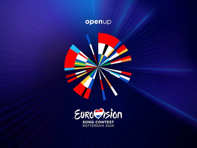
Following the announcement of the Open Up slogan last month, the EBU today unveiled the logo for the Eurovision Song Contest 2020. The design forms the basis of the Eurovision 2020 events and celebrates 65 years of the Eurovision Song Contest.
The logo represents the colours of the flags of the 41 countries participating in Eurovision 2020, in order of their first appearance. The idea behind the logo is explained in this video from the EBU.
“The Eurovision Song Contest was established a decade after the Second World War with the aim to bring Europe closer together through music,” the EBU writes. “Over the last decades, the competition has opened itself up to new countries, new talent and new technology. To reinforce that message, a data-driven vignette has been developed that celebrates the story of the Eurovision Song Contest in a contemporary way.”
The logo builds on the design of three previous editions of the Eurovision Song Contest that were held in the Netherlands in 1970, 1976 and 1980.
Those contests all had logos based on the same round shape, created by the Dutch designer Frans Schupp. The 2020 design keeps with the circular theme but adds a modern twist.
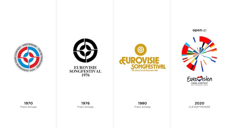
The pitch for the artwork was won by Dutch agency CLEVER°FRANKE. The designers used special software to help create the logo, merging the colours of flags into the distinct design.
Eurovision 2020’s Executive Producer Event Sietse Bakker said: “This design follows the characteristics of Dutch Design: minimalistic, experimental and innovative. It tells a story, it’s colourful, festive and, not unimportantly, widely applicable.”
Bakker also notes that as the Netherlands was the first country to perform in the very first Eurovision, the timeline begins with the colours of the Dutch flag.
Eurovision Executive Supervisor Jon Ola Sand also praised the logo of the very last contest he will oversee.
He says: “We are very pleased with the artwork of the Eurovision Song Contest 2020, which perfectly celebrates our 65-year history. The impactful design also includes the modern diverse and inclusive values of the event and complements this year’s slogan “Open Up” in a beautiful way.”
What do you think of the Eurovision 2019 slogan? Are you loving it? How does it compare to recent years? Let us know down below!






Navajo country
I don’t mean to be rude but l really hate the logo. It’s like they took JESC 2017 logo and just improvised it.
Love it 🙂 Love everything about it. One of the best logos I´ve seen so far in the competition. Greetings from Iceland.
PS. It´s Jakob with a “b”
I think it’s ugly
Oh no, another blue-backgrounded logo!!! Please stop it!
Eurovision can recycle this logo til eternity if they are planning to refuse Kazakhstan’s entry forever.
Greek people would be mad and riot if they ever see the “MK 1998”. People might think it just a name but it much more than a name it historical name that is disputed.
Put N on MK and do not try to recreate this whole conflict again that the both goverments ended last year.
Im not greek person btw just person that love to see the slowely process from the eastern/balkans to moving forward from all the conflict.
MK is still the ISO two-letter country code for the Republic of North Macedonia.
When I first saw the logo, a couple of things came to mind: It first looked like a pie chart which usually breaks down election results, party-wise voting percentages or just a graphic display of survey results. If you could set the logo in motion, it could have evolved into a lovely kaleidoscope vision or a magic colored spinning wheel (wheel of fortune?). It took me less than 2 seconds to figure that it had to do with the participating countries’ flags, even though only few color sequences made sense of that. After you learn about what’s behind the design,… Read more »
Since they are celebrating 65 years of Eurovision, couldn’t they have included every country that has participated in the past as well?
I dislike the fact that some flags are recognizable and others aren’t. I know the colors merge into each other but if you don’t know this, you get the impression that some countries are more important than others.
I think the concept is absolutely brilliant. It’s just as inclusive and open to interpretation as the slogan and it also makes references to the Dutch previous (huge) History in the contest. It may won’t look as beautiful on merchandising products as other logos in the past, but it has style and substance. As others here mentioned, I already can see the flags from the participating countries popping out from the logo.
Didnt like it at first, but the more I look at it, the more I like it. The only thing I wouldve changed is that it included all the countries that are not participating. They are all a still big part of eurovision history and should be celebrated regardless of whether they are there or not.
Very ugly
Please i’m sick of these blue themes… Can’t we just get a pink one or at least purple, green or red?
I second your comment. I’m sick and tired of these bluish or dark shades background logos! The epitome and of boredom was this year. Only Baku 2012 and Lisbon 2018 were the brave guys!
It reminds me of the american windmills that were all planted in the polders in my province (Friesland) My father hated them, and most of them have gone. The ones that are still there are now considered monuments and are restored. O tempora o mores. No need to say I think the logo is beautiful and clever. Well done!
Yeah the design is pretty cool and different, but as a Estonian I’m sad that Estonian flag is not represented 🙁
Wrong, Estonian flag is represented. Pause at 00:33 on YouTube. You’ll see it on the bottom left side.
As a dutch person I’m offended that some people really wanted a windmill/tulip/cheese WHATEVER… Like really?? Anyway great logo, I’m curious how this is gonna be incorporated within the contest. Like a sliver of the logo of the corresponding flag of the country that is gonna perform next comes out?
Agree. And Rotterdam is the last city that should be associated with windmills and tulips.
I completely agree. I am not Dutch but I am appalled that people would like this kind of clichées…
No.
I looooove this logo. I love the fact that it is inspired by the previous logos, while being super slick and modern, honouring the ESC tradition and the contribution NL has given us throughout the years, as well as all nations participating in it. Again and again, every news we hear about Eurovision 2020 just shows how it is going to be soooo much better than last year’s Israeli horror show
I like the addition of the 5 rays of light on the right-hand side, a great way to commemorate the Netherlands’ 5 victories in the contest
That being said, the design is very clever and I’m intrigued as to how it will look in full action as well as how it will be tailored to each of the participating countries
I do like it, but I feel like it’s too abstract and maybe even a bit complicated. I mean, it does need a three minutes explanation when other countries just when for something which represented certain parts of their culture (a flame for the Land of Fire, a star for Israel, a marine animal for country with a rich navigation history as Portugal…) or something simple (Sweden’s butterfly and dandelion or Denmark’s diamond). Maybe something in the same terms but simpler (I’m thinking on a (very dutch) windmill with all the colours around) would have been better. But maybe it’s… Read more »
There is no Bulgarian flag in the video SCANDAL
That video was probably made earlier. I’m sure they have updated it.
It corresponds with the slogan and NL’s previous logos (especially the 1976 contest). I absolutely love it!
People really wanted a cheesy tulip?! This is art & easily the best logo of the last decade!
That’s a bit overrated.
Anyone notice that it eerily resembles the Junior Eurovision 2017 logo?
Notice how those 5 glowing blue lines represent the 5 times The Netherlands won.
I am super pleased with this logo. I’m also thinking that they can incorporate the logo when changing to different countries. They bring forth a certain piece of the logo and we land in the colours of a country and their act or jury results etc. And it’s artsy as well. If they wanted to focus on individual countries, they would just have kept the flags as they are. In this way, it’s like every star in the US-flag representing a state. Every country is represented, but it’s the symbol of unity. I agree with others here. It’s a classic… Read more »
I’ve been watching Eurovision since 2009 and out of all the years I’ve been watching, this is the most satisfying artwork I’ve ever seen. Before each performance, I want the graphic designers to highlight each country that’s about to perform. It’s gonna take me a while to figure this out on my own
P. S. Azerbaijan makes San Marino look like Uzbekistan
interesting, creative, good bit of thinking from our magic 100
I like it!
I like it.
Why the background has to be blue?? Seriously it is not the only color in the world.
Most of the surface of earth is water. Yes, water is transparent, but it is often represented by blue.
Like the idea, execution not so much
Considering the nagging by the usual and to be expected suspects, I say: job well done.
You are very much part of the so-called naggers and expected suspects, usually.
You have to have a particularly schizophrenic imagination to find Estonia in this tasteless puree. So I suppose “Open up” to them serves as a code for “give up your national identities.” No, thanks.
Estonia is at 7 o’clock, but with black first, then white and blue. Reverted colors like Germany. Why? It’s a mess. Conspiracy theories will rise.
It’s because from that block of new entrants (1956 vs. 1994), the black from the Estonian pie is least dominant (percentage-wise). If it would be in the middle of the pie or in the centre, then blue would be too dominant (looking at the blue in the flags from the 1994 debutants. Also, I think they used some liberty in the color scheme to make it a more coherent wheel?
BTW is an ARTWORK and not a LOGO …. idk if there is any difference in it but the official esc page and the dutch one keep calling it an artwork so?????
Also, where the f*** is Austria in this? All I see is Latvia’s shade of red. Are we supposed to share? I would like to withdraw my earlier misgivings and double down: It’s pure garbage. Since when is it considered an innovative idea for a logo when you have to torture your eyes and brain trying trying to make sense of it?
Come now. Let’s not behave like the Milo Yiannopoulos of Eurovision. It’s in the end just a logo :-).
Come on now. You could have at least upgraded me to the “Ann Coulter of Eurovision”. 😛
they’re a mess for sandwiching bulgaria and italy in one flag and making both unrecognizable, yet giving each blue-white-red flag its own segment just bc the dutch flag is of those colors
edit: omg i see another supposed italian flag next to ireland’s ksjhfjs issa mess idk i don’t vibe with this
The supposed Italian flag next to Ireland is the Portuguese flag and the Italian flag is (sandwiched) in the first segment of the circle.
oh so they fused us with portugal wig
i’ve seen the merch and tbh that shirt doesn’t look good on itself let alone on someone. judging anyone who’s considering buying it n i say it as someone who wears animal print more often than anyone should
It is supposed to symbolise the years in which all of these countries joined, hence why some red, white and blue countries flags are separate.
For someone who likes to trigger delulu nationalists, you are very easily triggered yourself.
I think it’s look olympic-ish (in a good way) and maybe it would look cool as a backdrop for the stage and scoreboard, also i already seen the merchandise design with the logo on it and it’s looking good. Also, it’s kinda remind me of 2014 Commonwealth Games and 2018 Asian Games logo
I love the detail of the 5 brighter beams shining from the logo, which represent the years the Netherlands won.
I wanted to say that too. So clever!
Is anyone else seeing a butthole with the words Open Up above it?!!?
If your butthole looks anything like this you need to see a doctor asap!
It has had all the nations of Europe present at some time….
LOL best comment ever
Usually I like logos that incorporate elements from all participating countries, but as some others have pointed out, no one would understand what the colors mean if it is not explained. Plus, some colors are very common in national flags, so unless there is only one debut country in a particular year (like Iceland), otherwise a country will not be uniquely represented in a logo. And for 2015, Australia debuted, but its flag in the logo looks more like France? The Netherlands? I could not figure out it is Australia.
Because they’re only representing it in a color triad, which is a very un-design approach to the flag. It does not need to look representable when the main goal was cohesiveness.
They are only using the colours of the flags. Not special items on flags like the Swiss cross. They use only the colours and not in a special order of each flag.
I think this wil be usefull in May. Just wait and see.
But are there 41 flags? I counted around 30. If Hungary is there, should be Morocco, Andorra, others too. Maybe I’m wrong, but are not enough flags.
Watch the video
There’s a great image on Sietse Bakker’s Twitter-page. That explains everything even more thoroughly.
Really unique and creative, this is something we will remember!
Modern abstract art is complex. Same with many examples of Dutch graphic design. But perhaps we should embrace complexity more. Jaap Drupsteen and Piet Mondriaan didn’t design because they needed to be easy for the eye and visualize too much on first sight. They wanted it to make people think and discuss about it. Having said that, even if you like it or not, this is perhaps the first time since the creation of the official Eurovision logo in 2004 that I think the surrounding artwork and visual identity creates some legacy. This will be the first time in many… Read more »
I love this!!! It’s a great idea and so different!!!
I like it, but the fact that needs explanation and people will not understand it instantly, is not how a logo should be. And Germany for example, doesn’t have the colors in order. But it looks good overall.
Hehehe. I was half-expecting the Netherlands to re-use/incorporate their previous circular logo from their past hostings in one way or another. Seems like I was right on the money.
Love the design process behind this. Simple and elegant!
I think the concept is excellent, but execution not so much. Just looks sloppy and not very appealing to the eye. But it’s just a logo that won’t affect the contest in anyway, more so for marketing