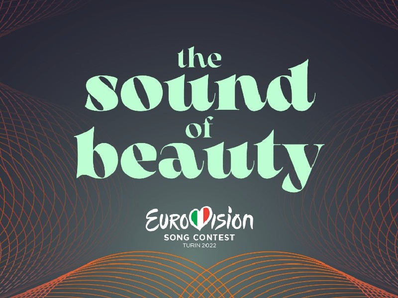
La Bellezza del Suono — the sound of beauty. That’s the slogan for the Eurovision Song Contest 2022 and the accompanying theme artwork that will appear across host city Turin and in the show’s visuals on TV and online.
In recent days fans have compared the logo, which in one rendering appears as a dark circle with sound waves around it, to a solar eclipse, the fertilisation of an egg and a stereo speaker. But now all is clear.
This is how host broadcaster Rai and the EBU explain it.
“Turin’s theme is a visual representation of The Sound of Beauty. In order to represent sound and its visual (and beautiful) properties, the design is based on the symmetrical structure and patterns of cymatics – the study of sound wave phenomena.”
“The term ‘cymatic’ was coined in the 1960s by Hans Jenny, a Swiss scientist and philosopher, derived from the ancient Greek word κῦμα (kyma), which means ‘wave’. His experiments showed that if fine powders were placed on a sheet of metal and acoustic wave vibrations were applied to them, these particles were organised into specific patterns.”
? This is the #Eurovision 2022 theme art in motion. Looking good!
— wiwibloggs (@wiwibloggs) January 24, 2022
pic.twitter.com/ltz3UdhQD6
Those patterns — so-called Chladni figures — form symmetrical (and often dizzying) shapes in the case of harmony.
So, as it turns out, fans weren’t off the mark with many of their guesses. The waves around the dark circle do, in fact, hint to “both the sun and a cosmic portal that can be opened to the idea of the sound of beauty.”
The Sound of Beauty typeface
Separately, many fans have expressed a deep love and affection for the typeface chosen by Rai for the slogan “The Sound of Beauty.”
Rai has clarified that it is called “Arsenica” and is “a serif typeface designed by Francesco Canovaro for Zetafonts, and developed by a design team including Mario De Libero, Andrea Tartarelli and Cosimo Lorenzo Pancini.”
It may feel familiar. The font was inspired by vintage posters used in the early 1900s. Shout out to those Old World alcohol ads that so many know and love!
View this post on Instagram
In their announcement, the EBU included a photograph of two Italian gardens — or Giardini all’Italiana. These elaborate green spaces are known for their swirling shapes and symmetrical designs.
While not giving away too much detail, the EBU confirm that these gardens were “one of the main inspirations for the set design.”
Atelier Francesca Montinaro — the established Italian design house behind this year’s stage — have at times played with baroque-inspired themes, as seen on their stage for Sanremo 2013. The stage included many parts that could be moved to change the look and feel. Perhaps we should all start Googling “Early Baroque gardens in Italy.”
That history, coupled with the recently revealed stage plans that call for moving circles and spinning floors, suggest something very ambitious indeed.
What do you think of the art work and explanation? Are you loving it as much as we are? Shout it out down below!
View this post on Instagram




I like it, not surprising that good taste in style comes from italy.
well done and good luck from israel(:
When the theme was announced, I felt underwhelmed. Now, that the whole concept has been explained and everything related was presented, I’m glad they did, because the whole thing sounds ambitious and cool!
another eurofan drama story killed with success
the whole thing looks great, as expected
Thank you. When the logo was uncovered here a couple of days ago, it was a stream of bad comments. Now, the explanation has been given and many changed their advice. I believe this logo and the meaning behind has much more deep and mindful/wise explanation that many other logos of the past, especially the one for Rotterdam 2021. So now the attacks go on the color choice, the font choice, etc. When I read the comments on the Youtube video published on the Eurovision.tv channel, there are 99% of positive comments. Here it’s the opposite. Biased eurovision fans who… Read more »
Especially the one for Rotterdam? It’s clear you haven’t understood a bit of it. Mondriaan, Mondrianesque? Never heard of? Exactly what I thought
Yes. I, know Mondrian, I know the underlying message of it. Of course it was nice too. But that was purely an art based meaning. Here the meaning seems to go beyond., to science, theory of waves, etc. Anyway it’s not a race. I love all the logos included the one of Rotterdam 2021. The animations with such logo were wonderful.
I wasn’t so sure at first but after seeing it in animation and reading the thought behind the concept, I can say that this is one of the best logo and slogan for Eurovision.
Now, this does look better in motion, however, it also highlights the issue. This isn’t a logo, but a graphics package. As a graphics package, it looks quite pretty IMO. I really like the movement and the shapes the soundwaves make. However, unlike previous editions, there isn’t a specific edition logo, opting instead to put the generic Eurovision logo the center of attention (while usually, the art design logo is in the center, with the ESC one being secondary).
You know what would be fun? If the logo would move in sync to any of the songs. Like how the heart in Mello is but actually cool.
After looking at the animation, the logo doesn’t seem so bad anymore. I like it. I appreciate the research and concept behind this, and the explanation by RAI does make a lot of sense. But I do understand people’s skepticism towards the color palette of the logo. Personally, I wish they would’ve made the colors a bit bolder. And the circle in the middle seems a bit unnecessary (why in the world does Moroccan Oil have to be featured in it?) On the other hand, I think the font is really cool and old-fashioned. The Sound of Beauty is an… Read more »
The Moroccanoil logo must be there because they are the official sponsor ans pay to be visible. We can argue it’s too big. But we cannot cancel it.
Yes, much too big indeed
At least it’s different. I mean I’m not sold on the color patterns but you can’t use standard blue every year.
Still not convinced I’m sorry, I don’t get it. In which way it replicates the italian flag colors? In motion it’s better!? Really but it doesn’t change nothing guys I’m sorry, San Remo’s logo is beautiful and eye catching but this not at all.
Loool am I obliged to like it? Everybody is obliged to like it? Sorry but 2 years ago I loved the Rotterdam’s logo when the majority disliked it, this time I don’t like it, it’s my right.
The color scheme utilizes the Italian flag colors.
Ok if you say it, but I don’t see that….sorry
It’s well blended together.
Too well blended for me then, the result of this mix is a color that I don’t like, it’s not really “Beauty”ful for me but this is for me, I’ve never found the brown really attractive if people like it no problem they have the right like me to dislike it, some people have hard time to understand that here unfortunately.
You’ll see the color as the sound waves moves in motion, each wave having a tint and a hue taken from the Italian flag colors.
Maybe, I rewatched the presentation vid and I still can’t see that, let’s see but for now overall it’s still too dark and not very joyful imo.
The design reminds me of the 2020 Eurovision medal. https://www.youtube.com/watch?v=DKjipQu99yA
It looks way better in motion. Doesn’t feel lazy and rushed anymore when you know the thought process behind it. I like it.
Is Moroccan Oil part of the design team? Green, huge logo, the sound of BEAUTY.
I must admit it gets better with some explanation, maybe they should have started with that instead of just getting it out there.
I remember learning about Chladni patterns but I don’t remember them being this complex. Never thought science would come into the Eurovision logo
This is the beauty of the choice. The selection process behind is much more complex than any other logo we had before.
I liked the slogan and the font used for that right away, even the colors, the only thing I wasn’t sure about was the logo. Now with the explanation I was blown away! I’m happy with how Italy is taking Eurovision to heart, honestly I don’t remember so many intriguing and deep concepts related to the Eurovision graphic concept, this edition will be remembered for all the positive reasons. Grazie Italia!
La Bellezza del Suono — the sound of beauty, William, you translated it in Italian wrongly, La Bellezza del Suono means in English the beauty of sound!!! Why can’t you speak Italiano properly?
Be kind. He is not Italiano.
Like italian would be a lingua franca. Stop being braggart!
After watching the video I seriously warmed up to the concept and the visuals. Sure, the colors could be more vibrant, but the animations will already make it more lively. And there’s something old royalty about the matte colors that I believe matches Turin’s personality. Since the sponsor name is a “necessary evil”, the only thing I can’t get past is the solid dark circle in the middle of it.
Try to think of the big circle as something else, maybe that will help – for me, it’s a solar eclipse.
A black hole. Music emerges from the black hole and perturbs the event horizon influencing those waves who start to spread in the universe. I believe the logo has much more layers of interpretation. And I find it more intriguing than the geometric logo of Rotterdam 2021, which was only an animation of flags. Here there is a multilayered explanation intermixing music technology, theory of waves, theory of sound, interference, etc.
Guys, I’m trying. But everything I can see there is a glass coaster! Jokes aside, I think both the Netherlands and Italy came with clever concepts. The Dutch was more succint, but I liked it too. It’s also clear to me that the days when everything was about a logo to be used on merchandising are gone. In both cases, they thought about about a whole package of designing possibilities. Italy even took it to another level by including the actual stage on the package. So, the logo itself is just a small piece. If I liked all the rest… Read more »
Honestly, the only thing that I was questioning about the logo and I still feel like I have the same question is what is the purpose of the circle? I like the lines around the circle, i’m guessing that they will have every countries flag colours like the logo demonstrates, however if the lines have the colours of the countries flags, then what is the center of the logo going to have for each country? Will it just be the name, will they remove the circle when using it for introducing different countries. To me it just looks a bit… Read more »
I believe the circle in the middle refers to the shape of the stage design. They said the stage will resemble a sun.
When the theme art was first revealed, I thought it was a lazy dull design. After having seen the animation of the logo now, I actually like it. The animated soundwave shaping a heart within the center circle is really well done. Sound waves isn’t really creative or something, but it represents music and the Eurovision Song Contest. In some way, the theme art could even be used as a way to tell people, who don’t know a thing about Eurovision, what Eurovision is about: music. The orange color is a great choice. Orange is warm and comfy, which could… Read more »
I didn’t feel any positivity looking at those colours lol
All other colours on logo are not warm ones
Everyone has their own point of view with colors. One does feel the emotions of color, the other doesn’t feel emotions of color. Not feeling the emotion of color is totally fine.
The other colors are indeed cold colors. The mix of cold and warm colors creates a cold-warmcontrast. Because of the cold-warmcontrast , the orange color draws the attention.
Thinking out of the box, the cold-warmcontrast could refer to the Italian classical art culture.
I quite like the colors. Actually, the first thing that came to mind upon seeing them were the flavored San Pellegrino cans, which somehow seems appropriate.
I wonder if during the contest the logo will become the song’s sound waves? That would be very cool 🙂
The idea is great but the concept….eh, i personally dont like it at all.
You’re contradicting yourself. Idea and concept are the sane thing.
It’s very modern and retro at the same time! I love it! Amazing concept
I appreciate the design more after hearing the explanation, but i just can’t get over that damn color scheme
Sorry, but I still can’t take it seriously. It is just bad.
I love the story behind this and I think it is beautiful, but the way it is designed and paired with those colours is bad. If those shapes represent the diversity of different sounds then why that dull background colour?
I like the logo and the sound wave idea. The video explaining their creative process and story behind it made me like it more and was very interesting. I’m still little on the fence about the slogan’s font though. Especially when it’s that pastel green color.
But at the end of the day people are going to remember the songs and artists from this year and not the logo. There has never been a year when everyone has been happy about the logo and slogan.
I really like it in motion and the different colour variants for the poster work well
The logo in the slogan looks horrendous. All the animations and the whole concept is goo, though.
So I wasn’t that far-off with my first impressions of them utilizing elements of vintage Italian cinema. 🙂
As many suspected, this all works so much better in motion. Love a retro aesthetic and the concept of sound waves as art. It might suffer a bit in still images, but no one can say there wasn’t a lot of thought put into this. I’m intrigued to see how Italian gardens and the rumored sun shape will be incorporated into the stage design. Still a bit annoyed at the prominence of the sponsorship, which Italy likely has little say in to be fair, but it is what it is. I hope we also see some country branding in the… Read more »
This logo reminds me of those true life crime scenes where there is some waves going background, so yeah not that good. Very ugly and it could be some Grey’s Anatomy background when someone is about to die? CHANGE IT!
Disgustingly awful, they literally have better logo for their very own San Remo festival! This is not fresh and good, it’s outdated and ugly!
Good. Greet for the Italians (and for Berlusconi) the nephew of Mubarak.
I wasn’t a fan previously, especially about the slogan, but the way the graphics move in the video seems quite interesting and visually fluid 🙂
Morrocan Oils presents The Eurovision Song Contest or Morrocan Oils Eurovision Song Contest.
Yeah, soon it will be Gazprom Song Contest.
I still think it looks like old Windows media graphics.
I think what is bumping people might be the dullness of the colors—it’s not as sharp and bright of a palette as we typically seen. It also feels like it’s more backdrop graphics vs a show logo. I’ll be honest it’s not my favorite but I understand the strategy behind it. The thing that makes me go “mmmm” is—shouldn’t it be “the beauty of sound”?
Text is too seventies – as in a bit too much! The design.. well it’s just so dark and boring! Nothing matches, and let’s get real; Mint green text?!
No blue for a year. Finally. I like the well thought idea behind the identity, they’ve time to make some improvements on screen here and there until May. Sound waves should be more emphasized in both color and quantity
Looks like those corona virus example photos to be honest..
Still awful
So depressing
I’ll be honest, I like it more now.
same
Just NO! The worst identity ever. Looks like a bacteria and the colors are so muted!