It’s September, which can only mean one thing… it’s Eurovision season! And as always, the rumour mill is turning. But this year, the leaks are starting early. A new image has fans wondering if a new logo for Eurovision 2021 has inadvertently been leaked.
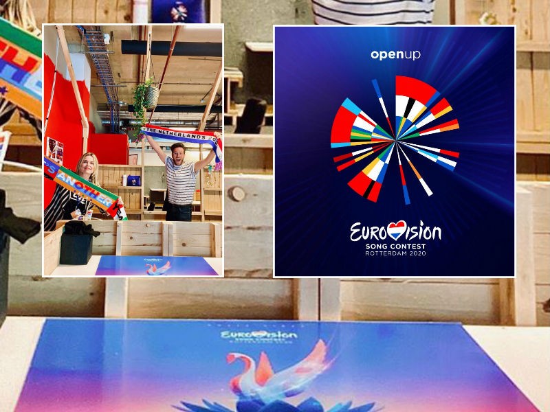
The image in question was first seen on Instagram. Head of Communications for Eurovision 2021 Babet Verstappen shared the picture of herself and her colleague, Eurovision Branding and Design Manager Ben Prins. The pair are seen celebrating the new season, sporting some Eurovision merchandise.
Prins holds a red, white and blue “The Netherlands 2021” scarf, while Verstappen holds a multicoloured scarf that reads “What’s Another Year?”, a reference to Johnny Logan’s Eurovision 1980 winning entry of the same name. But there’s something at the bottom of the frame that has caught the attention of Eurovision fans.
At the bottom of the screen, resting on a table, is something that looks like a poster with a Eurovision logo. The standard Eurovision Song Contest logo is at the top of the poster. Beneath that is a never-before-seen design, which fans speculated could be the new logo for Eurovision 2021.
This new design appears to show a long-necked bird emerging from a flower. The bird is coloured in shades of red, white and blue – the colours of the Dutch flag – and the flower resembles a tulip, a national symbol of The Netherlands. Some fans suggest the bird could be swan, a godwit – the national bird of The Netherlands – a common linnet, or even a phoenix rising out of the ashes.
Executive Producer Sietse Bakker says no to the logo
Any hopes of a leaked new logo for 2021 were soon crushed. Eurovision fan Katja asked Eurovision 2021 Executive Producer Sietse Bakker if the photo showed a new logo. His response: “Nope!”
Nope!
— Sietse Bakker (@SietseBakker) September 1, 2020
If past artist reveals have taught us anything, it’s that broadcasters don’t casually let slip their big news with a random social media post. When there’s a big announcement to be made, the news will be released in a professional way.
But that still leaves many unanswered questions. If that image isn’t the Eurovision 2021 logo, then what exactly is it? Bakker isn’t saying.
Could it be a potential design for the Eurovision 2020 logo that was rejected by the host broadcaster back in 2019? Or even a rejected logo for 2021? Or is it a design for some other aspect of Eurovision 2021?
Will there be a new logo for Eurovision 2021?
The Eurovision 2020 logo is still being actively used by the EBU in all its current Eurovision content. It can be found on the front page of Eurovision.tv and in the videos uploaded to the official Eurovision YouTube channel. This at least tells us the 2020 logo hasn’t been mothballed.
One argument for getting a new logo is that the 2020 logo was specifically designed around the 41 participating countries of Eurovision 2020. The logo represents a circular timeline from 1956 to 2020. Each country is represented by a wedge in the circle, placed where they debuted.
If a 2020 absentee such as Montenegro or Hungary were to return to the 2021 contest, they wouldn’t be represented if the 2020 design was carried over to 2021 — unless the logo was updated to reflect the 2021 lineup.
But one argument for sticking with the 2020 logo is that, well, it’s a lot cheaper than redesigning a new one. With the Covid-19 pandemic having taken a toll on the economies of most countries, any move to reduce spending would likely be appreciated by the host broadcasters.
What do you think the logo is? Will we get a new logo for Eurovision 2021? Tell us your thoughts below!





.
It actually looks nice. I hope to see more options soon.
This data driven logo received a silver European Design Award and for the total visual identity a golden EDA. So I guess no reason to change it.
There is one thing people are forgetting when it comes to the Dutch logos in the past. They have all focused around a circle. I’m not saying they wont change it but I remember last year after the logo reveal that they wanted to continue with the circular logos. So I think they will continue with the circle theme, even if they do change the 2020 logo
It’s actually quite nice!
As much as I like the 2020 logo, I want them to change it, because:
1. See it as a symbol that despite everything Eurovision is still standing.
2.The logo was a timeline and it could be subtly adjusted with new contestants.
3.Change for the sake of change makes no sense.
So I hope they won’t do something totally new.
Plus that bird looks too much like Russia’s branding in 2009. Netherlands would never want to look like they’re doing a rehash.
I really hope the old logo stays the same. Maybe it’s what Lisbon did and had a few logos as well as the main one
If they do go this path of a bird, I think that the Pheonix can be a very good logo – the legendary fire bird that never dies, when it does, it’s just reborn out of its own ashes.
It’s nice considering that the world and Eurovision had to “die” for one year, but came back alive and stronger immediately after.
This logo (If it is the logo) is just unrelated to anything…
My dad works for eurovision and it already has been decided months ago that we’re opting for a rainbow colored weed bud this year.
Nah nah nah the current logo of 2020 is very nice. I don’t think we need a new one. They should keep it for 2021 as well.
And it’s good and rare to see an executive producer so involved so active on the social medias and who take the time to answer the fans.
Maybe additional artwork similar to 2018 but with more ties to the Netherlands itself (not random sea creatures).
It looks pretty cool, where can I buy it?
Glad that isn’t the logo because that would be such a departure from the sophisticated design for this year.
I like a lot the logo planned for 2020, I find it original, colourful and it tells a story, the story of the contest, so I don’t mind if we keep the same or almost the same for 2021.
maybe there’s multiple like Portugal 2017, but idk tbh
wait no, it was 2018