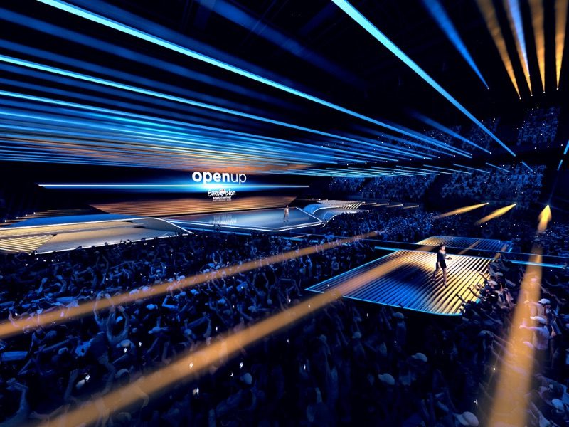
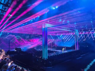
With less than six months to go until the Eurovision Song Contest 2020, the acts are slowly being revealed. And on Monday we got a sense of the stage they’ll perform on with the release of the first images of the Eurovision 2020 stage design. The stage for Rotterdam has been inspired by both the “Open Up” theme and “the typical flat Dutch landscape”.
This year’s stage has been designed again by the German set designer Florian Wieder. He’s a familiar name with Eurovision shows of the 2010s. He made his Eurovision debut with the ESC stage in 2011 and has designed the last three stages. Florian competed against Dutch and international teams to win the bid.
His design has an organic approach, as he explained in the official EBU press release:
“The design shows the connection between the sky, the sea and the land. The horizon links these elements and that horizon will work as a window to open up the world of Eurovision 2020. The floor plan of the stage is inspired by the canals and bridges that connect land and water in the Netherlands. With this design, we want to bring the artists as close as possible to the audience.”
Eurovision 2020: Stage design
The EBU has released renderings of the stage design, giving fans an idea of how the stage will look when it is built in Rotterdam next year.
Last year the green room — the place where artists wait for the results to be announced — was in a separate room from the main arena. But this time the green room will return to the main performance venue, keeping the artists at the heart of the action. This will, of course, help the audience feel even more connected to the artists from the 41 participating countries.
According to Sietse Bakker, Executive Producer Event of the Eurovision Song Contest 2020, the design works with the broader goals of the show:
“The design is innovative, modest and functionally smart. This way we can create a completely different look for each of the 41 participating acts, opening and interval acts and during the voting results. We’ll present an innovative stage design, grand in its simplicity and yet full of surprises.”
Florian Wieder says he also drew inspiration from The Netherlands’ rich history of design.
“I was inspired by the unique characteristics of Dutch Design. Based on that, I wanted to create an unconventional, minimalist and modern concept for next year’s show. I am very happy that the Dutch public broadcaster has been so openminded and has enthusiastically embraced this design. As far as I’m concerned, this is a new chapter in stage design, a wish I have had for a long time.”
About stage designer Florian Wieder
Florian Wieder made his Eurovision debut in 2011, when Germany hosted the contest in Düsseldorf. His design for Esprit Arena involved a large round stage with a giant video wall behind it.
He was brought back the following year to design the stage for Baku Crystal Hall in Azerbaijan. That design featured sharp angles, multiple catwalks and was the last to have a fully seated audience.
Wieder’s next Eurovision experience was three years later, when neighbouring Austria requested his services. For the Wiener Stadthalle, the stage was encircled by a series of tubes and featured an “eye” design at the back of the stage.
Two years later Wieder designed the stage for Kyiv, and was challenged by the limited size of the International Exhibition Centre. The design featured a round stage with a moveable “chandelier” lighting fixture above.
The German designer’s services were again used in Lisbon. His stage at Altice Arena featured many arching shapes, two outer catwalks and — controversially — did not use any LED panels.
Last November, he won Israeli broadcaster KAN’s tender for the stage design in Tel Aviv, which was designed around the idea of triangles and the Star of David.
What do you think of the stage design? Are you happy that the green room will return to the venue? Let us know in the comment section down below!


Exciting news! Edsilia Rombley, Jan Smit and Chantal Janzen will host the Eurovision Song Contest 2020!!!!
What should I do if I have the POST EUROVISION DEPRESSION???
Start getting excited for the next one
Off topic: there are new people elected for the creative team concerning ESC and still no Björkman! The head of contest will also be Dutch
no bjorkman? Rasmus disaprooves, who will put sweden to perform at a good position?
Well Twan van Nieuwenhuizen will be head of contest and will the decide the running order if i’m right
Looks a bit like a mix of ’12 and ’19. So from what I see now, it’s decent, but nothing to remember (actually, in the last decade, the stages he did NOT design were the most memorable ones – ’13, ’14 and ’16).
I have to disagree. 2015’s stage was really memorable to me !
I agree! 2015’s stage is menorable for being the worst of the decade! XD
I agree with you. I actually think 2015 stage was one of the best in the contest history. Also thought he did a decent job with the 2017 stage!
I have to disagree too, 2015 and 2018 is memorable!
Lol 2013? Really?
Is there really not a LED floor this time by the looks of it? Kinda lame…
Anybody see the JESC 2019 stage !! That looked so cool !! Why can’t they do something like that ?
Like what? An LED wall with some LED strips that look like wawes? I mean, that’s a very good stage for JESC but it was really nothing spectacular as people make of it. Also it wasn’t very versatile.
I wonder how wide the actual stage is. If the wings on the stages are for decorative purposes, I’d say the actual stage is on a good size to not alienate solo performers. However, I also can’t tell whether that island in front of it would be smaller than the main stage, because they looked virtually similar in size.
I haven’t scrolled through all of the comments yet but what the lighting on this stage remind me of is the lighting during the acoustic part of Duncan Lawrence’s final chorus. The staging during that part of the song gave me chills. I hope whoever designed it gets a shout out from Florian for the inspiration.
I hope they make the stage so big that we don’t get those ridiculous wide shots that Tel-Aviv became famous for.
if the eurovision will be half as goodl as the eurovision in tel aviv i will be satisfied.
well, it’s open
too low, I think flags might be an issue again
Him again?
If Tesla Cars Were a stage it would be this.
This is an impression, and I struggle to really picture it. It’s decent so far, just unusually wide (in my eyes). I’ll save final judgement but I’m not disappointed. Links in to the country too! Although I’m curious if there are rejected designs from local artists
Quick opinion measure, how does everyone like it compared to:
The JESC stage from 2007
Either of the MTV Europe awards sets or
The national final stage from 2001??
The MTV ema stage this year was very simple this year so I like Rotterdams better. 2007 JESC stage 2007 is quite dated compared to 2020 stage. But the national final stage in 2001 was brilliant
I like it, it reminds of the sea:
Though I would like to see a stage with light and colours, feel like they use darkness to much!
A mixture of Copenhagen 2014 and Düsseldorf 2011. 2 of my favorites !
Well maybe he should make better renders then?!
I think what meant by that is that the stage has a lot of hidden functions.
I bet it will be the most technologically advanced so far – simple, but amazing
I love how prepared and organized are the Dutch. Unlike the previous 2 years of drama. I’m sure the stage will look amazing live. Can’t wait!
How on earth 2018 was all drama?
@Bigger Lisbon had the drama of no LED
But this was an artistic choice not lack of organisation.
There was no drama in 2018… on the contrary EBU said everything was on point and before the expected date
Please let the the backings be on stage everyone!
Once again, the same name. How about some diversity? In my opinion all his stage designs look pretty the same. The design for 2020, for example, looks very similar to the 2016 stage, what’s the difference? Oh yeah, he added some lines now…or rays of light! Pfff, very innovative, indeed! Anyway, it seems to me he’s advantaged and favored by EBU or the organisers. Does he have a partnership with them or…a contract for life with Eurovision? Does anyone know?
See I understand what you’re saying… but he didn’t design the stage in 2016, that was done by SVT’s internal team. This is the first original Florian Wieder design imo since like 2012, so for once he is doing well again I guess.
It seems… pretty great. Like, I too am annoyed that it’s yet another Florian Wieder’s design, but you can’t deny the fact that the guy’s got experience. Over the course of 9 years he gained my trust, always providing slick, aesthetic, diverse and modern projects. And I feel like this one is no different, in fact I like this stage even more than the 2019 one. It looks like the lighting is gonna have a big role in 2020, and I just can’t wait to see it in action. It’s got an open, spacious, inviting feel, which fits the slogan… Read more »
Experience doesn’t equal quality or creativity
unpopular opinion but i’d rather have no leds and a more interesting stage design. leds are lazy, the best performers stand out without having to use tired backdrops
Agree.
Not what I expected in a million years. Not at all
Bridges and canals? I thought they didn’t want references to Dutch cliches. What next, tulip-shaped microphones?
Will this fandom EVER be happy with ANYTHING??
There’s a difference between being cliché and using famous specificities of the country as inspiration. As you can notice there’s no actual bridge tulip or mill on stage, is there?
It does look different compared to his previous designs
So does Florian just design any non Scandinavian stage? But it looks decent enough
Does Florian just design any non Scandinavian stage?
CON’s: . – Are the Dutch really that cold and minimalistic? ? . – The stage design leaves a lot of the stage show open to the imagination and interpretation of the 41 delegations (lots of extra props?) . – Seems the stage has been designed a bit separately from the actual visual identity / logo design. I wonder how this will be merged. . – Therefore the simplicity of the design doesn’t fully match with the complexity and ‘flat design’ approach of the logo. . . PRO’s: . – It is indeed very minimalistic, but that’s ‘Dutch Design’ and… Read more »
Totally. As a rule, I feel like as long as a Eurovision stage has proper LEDs, it can’t be too bad.
This is so weird I literally designed a stage just like it with the lights going all across the audience like that no joke they copied me lmao but it’s really good
I was designing my dream stage for ESC 2020
Am i able to send images to the comments section of wiwbloggs?
Doesn’t a designer at least have his/her own website?? ?
I’m not a designer I was just sketching it
unpopular opinion but i don’t think there’s need for leds. duncan and keiino barely used them. leds are lazy and make performances less interesting… reminder that the fuego performance was done with no leds just charisma !
Quite early for us to have a peak of the stage concept, isn’t it? The Dutch are not kidding! I agree with those who said that it would be good to have someone else doing the stage for a change, it’s important to avoid creative decisions becoming sort of a habit. But the truth is that Wieder is very good at his craft. I appreciate minimalism and I like the fact there’s an identity between slogan, logo and stage (the idea of open horizons, a modern take on some retro references and the rays of light).
The one thing I try to keep in mind before criticizing him too harshy is that certain broadcasters might have put restrictions on him that he needed to conform to. I would imagine that both the Austrian and Ukrainian stages were certainly not the best work he could do but that he just carried out what the broadcasters wanted from him.
That’s true, sometimes people forget that part of the work of the stage designers and the show producers is to make the best use of the budget they have. And it’s great that the overall level of the show has been relatively steady lately, even if we had countries/broadcasters with very different conditions to finance it. Not even mentioning that what works for the size and height of a venue would be a disaster to others.
Seems very sleek and futuristic, but I must say, a bit uninspired. Not much of an improvement of the last two years.
Idk if its always the case but they are quite fast with announcing everything aren’t they?
Nowadays the trends are like it’s light and video that builds the staging and not the shape of a stage or it’s construction elements…
What interests me is not the shape of it, but it’s technical capabilities… and for ESC it should be the best available at the moment.
Drones for example used for lighting and for cameras will be a standard in a few years but it looks that it will not work with 2020 ESC stage yet.
Still, it all has to look amazing in tv and I bet it will at the end 😉
It literally just a led screen and lights :[
This design looks alright but it’s not exactly groundbreaking, is it? Including sentences in your pitch like, “The set design shows the connection between the sky, the sea and the land.” is the sort of nonsense that gets you the job.
Meh. He’s basically done the staging since 2011 except the years where it was actually exceptionally good.
Actully, in the Netherlands the concept of the sky, the sea and the land means a lot, although not much of it is clearly spoken. If you ever would stand in a polder and look into the distance, you can grasp what I mean.
You can also look at paintings of old Dutch masters, especially those with landscapes or seascapes. Al those cloudy skies…
Cheap copy of the 2014 stage and yet he won the bid. Kk bye
It seems that a stage like 2014 won’t happen again…
Pro’s:
– easily adaptable to fit any style of act
– Fits nicely in the theme of the Netherlands
– great audience-performer chemistry
Cons:
– not very original in design elements
– it doesn’t give me the feeling we’re celebrating 65 years of Eurovision, which is what they are focussing on with ”Open Up” and the logo
Overall I like it! It’s what the acts of each country do with it that counts after all. I don’t care if it’s Wieder again, as long as we have a stage to look at I’m happy
I feel like it’s taking a bit of inspiration from older stages in the 70s and 80s – a bit like the logo… I quite like it though
Is it just me or do most esc fans care more about the name of the stage designer than the looks of the actual stage?
Well, If I were you, I would get suspicious if the same set designer gets the job for four times in a row, for four different countries, and none of them were even Germany.
This could be my most favourite design from him so far. I’m a sucker for minimalism.
I… can’t really tell what it looks like from these pictures XD
In less than a week we got visual design and stage design. I’m impressed.
So Wieder made scene for Open Up ESC?
Because it’s clearly Wide Open.
:V
My biggest concern about the audience being so close is not only the flags, but also Stage Hoppers. I really hope theres something preventing that from happening
I’m disappointed it’s Florian again. I’m curious how the he always gets it – is the decision based on the creative merits of his design, or does it come down to $$$? Who actually makes the decision – the host broadcaster or the EBU? At this point, surely they could choose somebody else for the sake of variety, if nothing else. The article says he competed against Dutch teams for the contract – does showcasing local talent count for nothing anymore? I thought it was supposed to be a Dutch production…apparently, he was “inspired by Dutch design” and seemingly that’s… Read more »
Tbh the jesc stage by Poland looked better :/
am I the only one who can never tell how the stage will exactly look like by looking at these photos? I mean from what I’m seeing right now it could be a flop but it could also be one of the best ones ever. Anyways, it reminds me a bit of 2016 (bit small, yet elegant) so it must be good, however I think the dutch could have done it a little bit better. Let’s just wait and see:)
True that. I have also learned that sketches mean nothing. You have to see the real thing and how it lends it itself to the various performances.
I think we could all agree that ESC 2016’s stage was actually huge, right?
Innovative was the design of the 2014 design. His stages are plane with leds and catwalks. Wonder what was the competition by Dutch designers that he beat….
I mean, he’s good at it. Yes, his design is good and this might be his best so far. I like how flat and clean it is, and it’s out of the usual Wieder style (which of course involves a stage surrounded by array of lights), which adds a bit of uniqueness into the overall look.
But, why Wieder again? At this moment in time, I wonder if other set designer teams would start to lose interest in designing a Eurovision set, even for countries like France or Spain.