
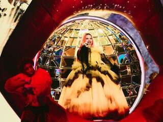
He’s done it again. Respected stage designer Florian Wieder has created a visual masterpiece for the Eurovision Song Contest 2025 in Basel.
Florian has decades of experience dreaming up memorable stages. As well as working on many German television productions, he has also designed staging for America’s Got Talent, Britain’s Got Talent, The X Factor (US and UK), and the MTV VMAs and EMAs and concert staging for artists such as U2 and Robbie Williams.
But Wieder is also known for designing several of the most memorable Eurovision stages, including Eurovision 2011, 2012, 2015, 2017, and 2019.
Mountains inspire Eurovision 2025 stage design

Here’s how the EBU describes it:
The stage design for the 69th Eurovision Song Contest has been inspired by Switzerland’s mountains and diversity.
Florian Wieder, the Production Designer with Swiss roots, is overseeing the Eurovision stage design for the eighth time. For this year’s event at the St. Jakobshalle in Basel, Florian reveals that he has taken inspiration from the Swiss mountains and the country’s linguistic diversity:
“Our goal was to create a revolutionary stage concept – a holistic experience that we’ve never seen before at Eurovision. Thanks to the immersive stage layout, the audience will get to be part of Eurovision like never before.”
Reto Peritz and Moritz Stadler, the Co-Executive Producers are enthusiastic about a design which is set to be unmistakably Swiss:
“In Florian Wieder, we have a Stage Designer on board who is a creative visionary and who knows Switzerland like the back of his hand. He has succeeded in creating a ‘signature stage’, which will forever be associated with Eurovision in Switzerland.”
Eurovision 2025: Visual and Audio Brand Identity
The EBU also outlined this year’s visual and audio identity.
The visual and audio brand identity for the 69th Eurovision Song Contest has been developed by Art Director Artur Deyneuve. His aim was to create a design that made people feel heard and valued. Inspired by the Swiss tradition of direct democracy, which revolves around listening and dialogue, Deyneuve chose ‘listening’ as the central guiding theme of the whole branding concept, calling it ‘Unity Shapes Love’. Deyneuve says: “If we listen to one another, we find love.”
This message will also be conveyed visually through the iconic Eurovision heart symbol, which stands for dialogue, unity and the unifying power of music. The pulsating Eurovision hearts have therefore become a core element of the design, representing the millions of people unified by the Eurovision Song Contest, to listen and celebrate together.
Moritz Stadler and Reto Peritz, Co-Executive Producers of the 2025 Eurovision Song Contest commented: “Artur’s well-thought-out design is emotionally engaging and takes Eurovision to another level. The Eurovision heart beats in time with the rhythm, symbolising the unifying power of music. True to the Eurovision slogan ‘United by Music’, it will bring people together all over the world.”


Why has the same person been the stage designer for years? Everything always looks similar…
Interessant wäre es auch gewesen, wenn Sie auch Fotos von den früherigen Buhnen gezeigt hätten, da Sie diese schon erwähnt hätten.
gute idee, haben sie sonst jedes jahr gemacht
“Again”? Das ist genau was sein Name auf Deutsch bedeutet.
the stage looks beautiful, the visual identity is dull and basic
About the “visual identity”…
It’s like a hybrid of Vienna 2015 (that flowing polka-dot pattern, now tiny hearts), Turin 2022 (that big black hole in the middle) and Malmö 2024 (that ondulating, sinuous gradient that then evoked northern lights and sound waves on devices, now sound waves).
copy and paste, for decades!
Love the stage! People are complaining about the font but they’ve probably screened different fonts before settling on this one. I’m sure they’ve considered how to make it look nice in the title cards, the voting sequences, etc.
The font actually reminds me of the fonts used in the early logos of Eurovision back in the mid 20th century.
Love the mountains and 2015 vibes!
I think a giant cheese filled with chocolate would have been better
I find the stage design really intriguing! Looks big and it seems it gives a lot of options to present it during the show. I wonder if the mountains shape will remain for each and every performance. If yes, that would be something new in the ESC history and would make a trade mark to this year’s show. Music motive sounds ok but i agree with those criticising the graphic design! Times New Roman looks so cheap, and as it was done in Word…:(
It looks nice.
The mountains are too literal which might not benefit certain acts but other than that, kudos to the designers.
I miss when each country gave us their own visuals, stage, showing more about their culture. Now, it’s the same theme, almost the same graphics, the same stage …
I know it takes place in a completely different Alpine nation, but I can’t help but think “the hills are alive with the sound of music.”
It’s gonna look like all others, 2016 stage is still by far the best stage in my memory.
Well, the mountains do make it a little more unique
I guess the greenroom will be back of the stage again.
No one has yet answered the most important question of all:
Will Guy Tell return?
He might hit the apple the time – the ultimate redemption story!
The pressure!
Who?
Eurovision existed before 2012.
reminds me of Tron anyone remember that film
I want something without LEDs. Love the stages of the 1960s and 1970s. Also, a more graphic artwork would be nice. This one looks very chaotic.
The stage is possibly one of the best we’ve ever had – it’s about time we had the geography of a hosting country replicated on stage, and the alps are the perfect start.
Whilst the stage is great, the theme is woeful. The font is just italics New Times Roman. The bubble heart graphic looks unpolished and boring, it’s hard to even distinguish the images when the bubble heart filter is overlayed.
Well Norway had an glacier as stage in 1986. And in 1996 it was supposed to be like an oil platform… so nothing new to bring geography or a feature of a nation in stage design.
Also Dublin 1994 had a “river” as a feature of the stage, hence Riverdance. Complete with bridge and cityscape backdrop.
Ganz genau, wieder back!!
Surprised they did not use the Helvitica font. I mean you had the opportuniy…
Soulless, but the Eurovision fandom deserves this for tolerating mediocrity for the last 12 years.
Amen!
Tallin 2002 was the best stage ever made in your opinion, right?
I started watching in 2006 so for my favourite stages are 2006,2007,2008,2009,2011. All beautifully constructed and different from each other.
Ah so 2010 wasn’t different from all the others? Lol! Literally the only one that really differed.
2010 can have an honourable mention. I like it for its simplicity, but it’s noting groundbreaking. Definitely the best none led stage of the 2010s
Did you check at 1:41 of the video that they chose to mention only «Switzerland, Ireland, Greece, Germany as United by Music » ?? A clear hint about what happened last year backstage ??????????
That part with that font is so “DeSiGn Is My PaSsiOn”…
interesting
Isaak was no bully.
And the whining of the fandom continues! You should stop watching, maybe you all lose your diapers then!!!
I am a proud citizen of EurovisionLand!
Just because I criticize our goverment does not mean I don’t love our country.
Turkey introduced heart shape with flags in it and even after 20 years heart shape continiues to be the dominating main symbol of the contest
EBU introduced it. Not Turkey….
Small cities , small arenas , permanent slogans and no logos , simplified visual artworks , removal of vocal rules , even the interval acts (from Justin Timberlake and Love Love Peace Peace to dated typical melfest performers)
why everything has to be minimalized i don’t understand
Boredom in perfection. Year in,
year out the same. That’s what ESC has become.
Then stop watching, so your crying stops as well!
In fact I did, this year. Didn’t need another Melodifestiven – the EuroVersion.
That Times New Roman font in cursive is the worst thing I have seen in recent years.
I wish we could return to the days when local talent got a chance to shine!
Once upon a time, the host broadcaster was just that – the “host”. Sadly, no more. The EBU have completely seized control and turned into a corporate machine.
I don’t want the contest to have the exact same vibe year after year. I want it to be an annual unique event, not Season 69.
I’m talking about Florian Weider here, not the art theme – which I kinda like.
Completely agree friend! Every stage’s feel nowadays seems to be the same every year. I mean the only stage that was kinda unique was the Italian one from 2022. But that came alongside other severe problems. I am also disappointed
Torino still had its own personality, even if all did not go well. Maybe how that played out is what secured Florian the contract for life… oh, well.
Ich finde die Bühne großartig, es scheint, als hätte sie viele Teile und man läuft von einem in den anderen. Es ist definitiv nicht langweilig.
Im letzten Satz ist das “nicht” total überflüssig!
It’s nice, I like the mountains, it reminds me the last Ukrainian staging. The overall concept seems interesting, the delegations will have the choice for their visuals, it can create really different atmospheres depending on which stage you perform. You can use the mountains on the first stage to show epicness in your performance, you can use the big frame on the central stage to make your performance classy, you can use the catwalk to bring dynamism in your performance, really many possibilities. This big frame will show Eurovision like a painting. It’s cool. My only reservation is about this… Read more »
Yes please, mountain heights and chocolate highs. Hopefully there will be so much delicious Swiss chocolate backstage and such, every one on chocolate is a happy one.
A Toblerone-themed stage, I like it
Lol, I really like Milka personally.
Hearts inspo at its best! They are tasty too!
I confirm 😉
Very odd looking stage. It’s long length makes me think we’ll see quite a few dance breaks or songs that have padded out instrumentals so that the performers can get from A to B for the different ‘Acts’ of their performances. I think it will be like the 2021 stage where we had a long rectangular length of LED, lightning or visuals to aid the performer as they travel across the mountains that is the stage.
So, we dont have a logos anymore? It has vanished?
The stage looks nice, but its just a concept and it remains to be seen how this will be in live.
Love the stage design, very boujee and fitting to the country. But this “united by music” identity thing has to go… same lifeless corporate design, same boring gradients every single year. Toss this nonsense already.
I don’t get the visual identity… No “United By Music” this time?
The hearts thing is very nice and the “listening” part is very nice too.
Here’s hoping the UNITED part of the slogan prevails.
United… as in, everyone? Or united… except one?
United, as in don’t prematurely disqualify an artist based on charges that were dropped due to inconclusive evidence.
I just don’t know how anyone can get excited about Eurovision still given what the organizers condone and support.
Go back to Reddit
Why we don’t use logos anymore.. This is only the visual artwork and it is small hearts surrounding a shapeless black hole