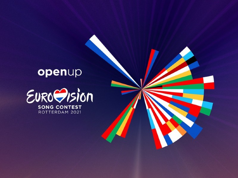
It’s finally here! After months of rumours and speculation, the official Eurovision 2021 logo has been revealed. The new artwork is a revamped version of the 2021 “Open Up” logo, designed to symbolise connectivity and togetherness.
In 2020, design agency CLEVER°FRANKE created the circular “Open Up” logo to symbolise the colours of the flags of each nation participating in Eurovision 2020, in order of the year each debuted at Eurovision. This time, Rotterdam is at the centre, with the colours of each country’s flag extending out towards each nation’s capital city. With Oslo to the north, Warsaw to the east, Skopje to the south and Dublin to the west, all 41 capital cities are featured.
The idea behind the logo is explained in this video from the EBU.
Eurovision 2021 logo reveal
“Last year’s artwork was about our legacy, telling the story of looking back,” the EBU says. “Now it is time to look ahead and tell a story about where we are going.”
“The logo for the canceled 2020 edition presented a data-driven visualisation based on the flags of all participating countries and told the story of the Eurovision Song Contest’s 65 year history,” the EBU writes. “The new design is inspired by the world map with Rotterdam as the beating heart of Europe in May 2021.”
“The logo connects Rotterdam with the capitals of the participating countries and symbolises coming together, regardless of the form,” says Sietse Bakker, executive producer of the Eurovision Song Contest. “It shows that we are open to everything the participants have to offer.”
Logo history
This new artwork builds on last year’s design, which itself builds on previous logo designs from when The Netherlands hosted the Eurovision Song Contest.
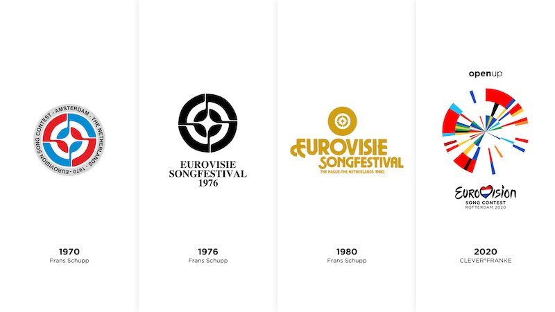
CLEVER°FRANKE co-founder Gert Frankie says the logo is an “extended” version of the previous logo. It maintains the “simple, intelligent, minimalist and experimental” elements and adds a “festive touch, to celebrate the return of the Eurovision Song Contest.” This decision comes after the EBU confirmed that Eurovision will return in 2021, after the 2020 contest was cancelled due to the COVID-19 pandemic.
Bakker goes on to reiterate Eurovision “will continue next year, no matter what” and that he hopes “to welcome the participants, press and fans to Rotterdam in May; physical if possible, virtual if necessary.”
Speculation and rumours
Earlier this year, fans speculated about a much more drastic logo change. In September, Eurovision Head of Communications Babet Verstappen shared a photo of herself in a studio with a poster featuring a swan-like design. Many fans assumed this was the new logo for 2021. Bakker quickly debunked this, confirming this was not the case.
What do you think? Do you prefer the 2020 or the 2021 design? Sound off in the comments below.






I definitely like it better than the 2020’s one. Less happening on it, and the colours sat way more visually pleasant along each other this time. It’s not owerwhelming anymore, I’d even say beautiful.
Also it looks like a clock (rather than a broken vinyl or TV-interferences like 2020’s one), everytime I look at it I can’t help but associate it with our patience staying at home during 2020 and a frase like “we were waiting for it, now our patience is rewarded, the time has come” comes to my mind.
I like the revamped logo, it’s really come full circle.
Dutch really do love circles. 😀 Honestly, 2020 logo was a little bit more appealing aesthetically to me, but 2021 logo has a nicer message. Yet, a logo is a logo, so if I would have to choose – 2020 logo is better.
I like the idea of an abstract map of Europe with Rotterdam as centrepoint but in my opinion the previous logo was more in balance.
I suspect it was the runner-up idea for 2020, but it’s still neat.
I like this one more than then the 2020 logo, the thing i love to see is the new background color 🙂 The blue from last year did’nt look nice with the logo, and we already had blue in a lot of other years.
I love it when logos aren’t only pretty but are cleverly thought out as well. I got that from the previous logo and I think this is a well-thought-out revamp with a nice result. I like that they kept the nod to our previous logos as well.
I kind of love this, ngl. It’s interesting and aesthetically nice.
looking at its shape it looks like a flower, and it’s also messy (in concept), but neat (in execution).
i honestly don’t expect a drastic change, it’s more or less still the ‘same’ contest.
p.s. i still want that YouTube thumbnail frame to decease. cmon it’s been 3 years since we keep using the same layout 🙁
Switzerland has no capitals. Not sure how they handle that one… Sick logo, tho.
It’s capital is technically de facto Bern, but ok.
Made me imagine if South Africa was in ESC – they’d need three capital city markers, for Pretoria, Bloemfontein, and Cape Town.
It ‘s a nice logo but I liked the logo of 2020 more.
Oh please shut up for all you who said that you don’t like this logo. I mean even for 2020 you said how it was mess. So please shut up.
I personally like it.
It’s just a logo. Wait until we start reviewing the actual music. 😀
Hah, so true! The logo commentaries certainly show how ready people are for ESC season 🙂
I actually like 2020s but this… is just a mess. And not a beautiful mess.
I get what the 2020 logo was aiming for originally (harking back to previous Dutch edition logos), but the 2021 logo is just a re-hash rather than a new concept. I appreciate that good art is hard to come by in a pandemic, and this shows rather painfully here. It’s only a logo though. The music is what really makes a song contest.
Which one is Australia?
That big blue spot on down right
We’re the Tasmania of the Song Contest
screaming bc accuracy
they should add blue and yellow for KAZAKHSTAN
I still love the graphic concept and now it’s easier to understand it just by looking at it. On the other hand, the other probably looks better in merchandising, for being tidy. I would probably stick to the old logo (as they did with slogan, stage design and hosts), but it’s not a big deal. The concept is still there and it’s a cool one.
Its fine I guess, but won’t go down as one of the best logos ever that’s for sure. Personally I kinda like it but I also really dislike it. Cool idea, but the flag representation gets real confusing real fast. Some countries like Ukraine and Polands flags look like they normally do (which leads to the real problem with this concept), when almost every other countries “flag” just looked like someone ate the flag and puked the colours back up. Why not give each flag the correct representation? Flags represent a country and its history, and just simplifying and putting… Read more »
I actually like it! Just apart from Iceland, Spain, Portugal, Ireland, and the United Kingdom, I’m having a tough time guessing which band represents which country lol. And obviously Australia couldn’t be to scale!
Nice
This is uglier, the idea behind it is good but still last year’s was better ( but not better than previous editions like 2014, 2018, 2019 )
They teased us for 3 days. Many fans (me, included) were expecting the announcement of Kazakhstan’s debut, though.
It would have been nice to see Kazakhstan debut (given their strong finishes in all three of its JESC appearances, two runner-up finishes and sixth place out of 20 competitors in its JESC debut), but I would have thought if Kazakhstan was going to debut in 2021 they would have announced it with the other participants.
I’m holding out hope they finally get their Eurovision debut in 2022, though. Kazakhstan debuting and a possible return for Andorra in 2022 would be interesting.
The most unrealistic expectation possible. From the first teaser with the flag dots it was clear they are gonna present the revamped logo.
??The Netherlands loves a good circle for their logo’s?
I mean, not a lot you can do with it. It’s pretty much the same slogan and the same host. I think it looks fine but obviously, was never going to have the impact of 2020’s.
It’s pretty much the same as last year’s but the difference being, this one is uglier. Last year’s was much better. Love the story of it but the design, yeah this ain’t it.
The logo is fine in of itself, but transposing flags onto it will be messy quite frankly. A stylised windmill/tulip, while cheesy, would’ve looked nice in the 41 different versions.
Come on we’re in 2020 lol, a windmill or a tulip…
Actually, I think you have a very good point. I do like the concept, but it does seem rather difficult to rework the flags of certain countries like Slovenia and Malta onto the logo given that the left part is mostly empty. Will be interesting to see how they will manage that.
That would actually look quite nice
I can’t imagine their intent would be to transpose the flag onto the logo… ever? Though, this’ll make it harder for the amateur designers in the fandom who make custom flags each year.
I can actually see this logo possessing an idea of a spinning windmill in it. I even remember the talk of this resemblance already from last year, only the new version of the logo has made the resemblance even more prominent.
So it’s the same as last year, with a slight re-vamp?
Yes, replacing the basis, which was year of entry for 2020, and geographical location here.
Yeah like them saying all the countries arecoming back and no others is not extremely exciting.
well, it’s fine u know – but to hype a slightly revamped logo for 3 days? they need to sort out what is exciting and what is not hahah
I already loved last year’s logo but this one is even better. Incredible job!! It looks really good while being totally understandable 🙂