Portugal — the small European country that once ruled much of the world from Brazil to Angola to Macau — has a rich history of exploration.
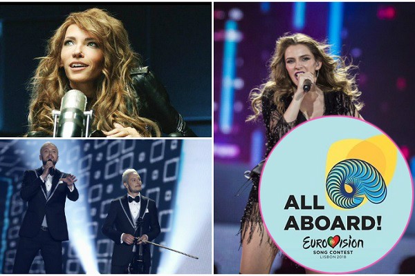
And today broadcaster RTP, in conjunction with the European Broadcasting Union, paid homage to that rich history with their water-themed slogan for Eurovision 2018: “All Aboard!”
Nodding to the fact that “Portugal as a country has always connected Europe to the rest of the world through the ocean,” the EBU said in a statement that the slogan seeks to “invite the international community to come together for this year’s competition.”
The logo isn’t a single image, but instead a series of images, built around the central
The EBU explains RTP’s motivations this way:
Europe is a collective of many, and this has also inspired RTP’s design team to introduce multiple logos for 2018, rather than a single image. The main logo, depicting a shell, will be used alongside 12 other versions. They are designed around the concept of the varying life in the oceans which depict the wonders of a floating world, such as plankton and a range of other organisms which are essential for balance in aquatic ecosystems. Through these multiple logos, the creative concept portrays key themes such as diversity, respect and tolerance.
The logos will be creatively adapted and have a variety of uses in the run up to the event, including being displayed all over Lisbon next May.
Jon Ola Sand, the EBU’s Executive Supervisor of the Eurovision Song Contest, said: “We are extremely happy with the creative theme and logos for this year’s contest, which resonate with Lisbon’s history and underscore Eurovision’s core values, including diversity, very well.”
“The ocean connects all of us, and its variety can provide good inspiration for each of the 42 participating broadcasters that we look forward to seeing in Lisbon next May.”
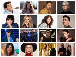
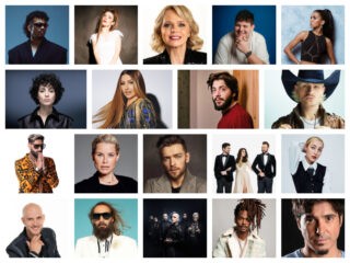
Eurovision 2018: The 42 participating countries
- Albania (RTSH)
- Armenia (AMPTV)
- Australia (SBS)
- Austria (ORF)
- Azerbaijan (ICTIMAI)
- Belarus (BTRC)
- Belgium (VRT)
- Bulgaria (BNT)
- Croatia (HRT)
- Cyprus (CYBC)
- Czech Republic (CT)
- Denmark (DR)
- Estonia (ERR)
- Finland (YLE)
- France (FT)
- Germany (ARD/NDR)
- Georgia (GPB)
- Greece (ERT)
- Hungary (MTVA)
- Iceland (RUV)
- Ireland (RTE)
- Israel (IPBC/KAN)
- Italy (RAI)
- Latvia (LTV)
- Lithuania (LRT)
- Malta (PBS)
- Moldova (TRM)
- Montenegro (RTCG)
- The Netherlands (AVROTROS)
- Norway (NRK)
- Poland (TVP)
- Portugal (RTP)
- Romania (TVR)
- Russia (C1R)
- San Marino (RTV)
- Serbia (RTS)
- Slovenia (RTVSLO)
- Spain (TVE)
- Sweden (SVT)
- Switzerland (SRG/SSR)
- Ukraine (UA:PBC)
- United Kingdom (BBC)
Eurovision Village and a blue red carpet
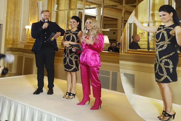
wiwibloggs attended the RTP press conference at the Lisbon Aquarium, and the organising committee revealed further details about Eurovision Village and the opening ceremony.
As ever, Eurovision Village will have a warm, everyone-is-welcome vibe and will be open for eight hours for ten days straight.
#Eurovision Village will be open every day from May 4 to 13, and from 15:00 to 23:00. It's free to everyone. pic.twitter.com/WaKKiQf6RD
— wiwibloggs (@wiwibloggs) November 7, 2017
In an unusual twist, the Eurovision red carpet, which precedes the opening ceremony, will actually feature a blue carpet.
It’s an overt nod to the ocean and the idea of water, which is so manifest in this year’s theme. We hope that Laura from Belgium and Saara from Finland haven’t already bought dresses thinking they’d be walking on red carpet….
The #Eurovision 2018 red carpet will actually be blue — thereby nodding to the oceans and exploration. pic.twitter.com/jnlzixLc3n
— wiwibloggs (@wiwibloggs) November 7, 2017
What do you think of this year’s theme and logo? Are you excited that the red carpet will be blue? And are you going to party with us at Eurovision Village? Let us know below!


Nice logo – pure and simple! I like the use of colours.
Good slogan! Both displays Portuguese history, Vasco da Gama etc. AND how ESC unites people for a short span of time. Musical cruiseship in this case. Different people, cultures, languages, music etc.
But we need a MUSIC-SLOGAN soon! Really a contradictonary thing that so few of them have been about music. But perhaps it’s not necessary to state the obivous.
I actually really like the colors they have used for the logos, this light blue and yellow theme feels very joyful and light-hearted, which is a change from 2017’s dark blue and pink. The simplicity of the logos also goes this way (I love the jellyfish !). The overall theme feels very soothing to me 🙂
The slogan doesn’t really shock me, it’s not like Eurovision slogans had never been cheesy.
I like how they decided to make it all related to the sea ! We haven’t seen this kind of “general theme” in the most recent years.
Sweeties, It’s only a logo!!
A great Song Contest is remembered for its good MUSIC, not a silly logo!
Absolutely the right attitude from Portugal. Don’t spend what you don’t have to on pointless brand marketing. Thumbs up from me.
I agree! But I have to add that I personally like this slogan / logo
https://www.youtube.com/watch?v=gQy0PJEkQhA (Latvia 2008)
Now I see where they got their inspiration from 😉
Was is supposed to be a connected there? Can’t see any.
Seriously?!? Ok, it´s nice that Portugal is doing well with preparations and all, I wish them all luck. But this was an odd and boring logo and tag line. Feels old, boring, not too imaginative, or expressive. I´m just confused, and my first reaction is just an underwhelming feeling. Their first temporary background with the light blue backround, waves, even looked better than this, why did they just not use that one? I hope they have that incorporated somehow with the newly revealed logo..
I am still not a fan of the maritime theme, but it is working ok for me. I agree it could be more about environment and less about a “passed glory”, but I think there will twist it into a more inclusive message. I actually find the slogan fun: it has an inclusive message and has just a little bit of cruise ship-inspired cheese… As for the logo(s), sorry, but I like them. This kind of vintage mid-century look is very much en vogue and reminds many of their childhood. So, so far so good… Let’s wait and see for… Read more »
Since I am at it, and inspired by the sea, I really miss the first ever Eurovision-beach or at least one Eurovision sunset-party… Wiwibloggs, here is a suggestion for you guys… Let’s do it?… 😉
If I’m not wrong, in one of the videos they did talk about the environment when they talked about the logos
all looks great and organized so far. good job.
It would’ve been so much easy for Portugal to make it about Ecology, not History. After all, if the ocean/sea level will rise, they are over.
they are over? Yeah right..the whole country is coastline there are no mountains in Portugal…
Over? i bet you’re another guy from Brazil or another ex colony. What a big inferiority complex yall have. Instead of worrying about ocean levels you should worry about the high crime rates and terror attacks you have.
It should be Welcome on/a board.
That’s for airplanes
it’s lovely and it remidns me of the little mermaid lmao
“Portugal — the small European country that once ruled much of the world from Angola to Brazil — has a rich history of exploration.”?? From Brazil to Japan!
Love the slogan All aboard! Its great!
Well done
”once ruled much of the world” and ”exploration”
are two different things.
—You don’t rule the world doing nice things to people.
—Exploration is just geography.
Are you sure you want those two together?
it was not me who wrote that…
do you use to read the articles??
They did rule half the world and they discovered and explored the New World. So what’s your point?
Herodotus, denis, matt, azaad, did you forget your email. Why use random fake names if you’re the same person. get over yourself.
Don’t put me in there. I’m myself, not anybody else. It’s not that rare to have the same opinions. I only have my name here. Don’t know these dudes. We don’t even live in the same countries.
it’s beautiful and funny, I like it 🙂
The logo looks too simple because it was made by the children in kinder garden. So it was normal to look childish :))))
I think that the slogan is somewhat adorable. But I do agree that the logo needs something a tad more complex
Beautiful concept. The Portuguese organization starts very well. I think we’re going to have something very different from the usual … sophistication, depth and elegance.
Simply great. A very elegant logo … A trilobite divided into 42 spaces that suggests not only the maritime theme that call for unity and diversity but above all the return to the origins, the origins of the most simple and beautiful in the world of Eurovision: TRUE MUSIC. Thank you Portugal.
Those logos look like figures I’d find on my middle school biology textbook.
NOOOOOO! I loved the logo that was appearing before… the one that looked like ocean waves and sound waves. I liked it as it broke the mound of a contained logo to something more freeing and fluid. It could have been used ininventive ways on merchandise too.
All aboard is not the most Captivating of slogans… Macedonia isn’t on board… I thought the creative was going to be a bit more expressive so a bit disappointed at this step back.
Really wish they kept the logo that was appearing before.
Agree.
I really loved the theme we have seen for the last few months, white letters on a blue sea backdrop (you know the one), and was hoping that would stick. I know it was more for that in between time when they chose a host city. Maybe it will in some way, whether this is an evolution of that or a replacement. Either way these logos are nice, I like the aquatic theme. Greece ’06 had a similar idea.
The slogan is interesting, but the logo (or the logos) are simply dul, childish and extremely cheap…I don’t think having 12 logos are not the best choice, lately you are not going to remember them, and that is not a smart move in corporate communications. I know they pretend to be the cheapest edition, but hiring kinder garden kids as designees is not good, indeed that goes against the children rights… Bad bad bad Portugal
they don´t pretend to be the cheapest edition….they just will not spend more than the necessary. 30millions of budget is not the cheapest edition for sure!
Matisse mariscal o las nuevas tendencias naif en el,diseño grafico frente a luminosos de ordenador que no eran realmente un logotipo, es mucho mas artistico el trabajo de lisboa en movimiento daran ungran juego. Calma en los juicios, quizas eirovision era hasta ahora demasiado ortera y no esta mal que se in telectualice un poco en este vIAJe
Actually so happy that Portugal are showcasing their culture and history through the connection with the sea. I’m so hoping for a truely Portuguese contest in comparison to the dull generic, political stuff we’ve seen in the last few years. This is what Eurovision should be about! We want to know the contest is taking place in Portugal/Lisboa as we are watching.
Never be afraid of your culture when hosting an event such as Eurovision. (Looking at you Sweden, Denmark and Norway).
Well done so far Lisbon
Logo is dull, seventy-ish unclear.
I would have expected something in their strong and passionate national red and green colours. The main one looks more like an elephant than an shell, or whatever it’s supposed to represent.
I love the logo and the slogan!
Both are creative, beautiful and they showcase Portugal’s connection to the sea and the ocean.
The main difference concerning the participating countries is that Russia is in and FYROM is out. Happy about the first, sad about the second. Hope we’ll see FYROM next year with a strong come back.
I really like the theme and logos because it feels fun.
A lot of people have said it looks JESC but that’s because the theme looks fun and bright.
The last time we had a bright theme was 2012 and I’m glad that Portugal haven’t gone with a politically charged theme like we are one or building bridges. These were almost in you face.
All aboard gives the contest the fun element back that’s been lacking in the past few years.
I just hope they don’t have a big boat as the stage.
So far, so good! Look forward to information about ticket sales soon too.
I. LIKE. THE. SLOGAN. VERY. MUCH.
And the logo(s).
Unlike previous years. LOL
Imagine the logos hand painted on a portuguese tile.
I like everything. They celebrate explorers like Fernando Magellan, not colonialism. Logos are predictable, but good. The slogan is the LEAST cheesy ever.
Sorry to press the issue but have you just made that up or have they actually mentioned Magellan? I’m not familiar with Magellan, but a quick look online and he doesn’t seem any different to the other explorers countries like Portugal and Spain sent over. Anyway Jon Ola Sand was talking about Portugal’s connection to ‘The New World’ which makes it sound like they’re all set to gloss over Portugal’s exploration history and ignore the attacks on natives, stealing their land and colonisation. I really really hope they don’t celebrate/glorify this.
I was just looking at the positive side, not my intention to hurt any feelings.
Not at all don’t worry?
Get over it Matt, portugal is not ashamed of its past, if you want the opposite go to UK or sweden where they’re ashamed of their european culture.
Se te olvido el genocidio ingles con los nativos americanos
True, England also had a substantial role. I just think the former colony nations need to be more honest about their history, and if Portugal decides to incorporate this into their Eurovision they need to tell the true story, not a fabricated one.
well im sorry but Portugal don´t have shame or regret about their History….
what is the true story?? The one who like it? Please..Portugal is by far the old colonial power with better social relation with their former oversea territoires. Get some information about it.
The logo with a jellyfish is nice. It looks the most harmonious of all 13 to my eye. I would chose it as the main logo.
Aahahah I LOVE this people that are ALWAYS here to criticize! ALL ABOARD GUYS 😀 This is the Portuguese power!!
I like the logo and love the slogan, and honestly I don’t get most of the criticism. These are NOT simple logos, they are minimalist (like Appel). Minimalist style is actually very hard to do, they need to show a lot of information in a very simple way. The shell it’s not just a shell, it has 42 “spaces” which represent the 42 coutries competing in eurovision, there’s also a open space meaning that eurovision is not a closed group. About the logo, it has the same message as the other ones, but with less crap. To be honest we… Read more »
All said!! Thank you!!
Thank you :).
The last “logo” should be “slogan”, my mistake.
Guys, lets just be happy that Portugal actually appear to be on track with organising the actual competition. After what happened last year, I don’t care what the logo is – I’m just happy we have a country who will be able to organise the competition on time!
It feels very JESC. The design, the colours, the phrasing. All I can think of is Titanic…
And it also has a whiff of colonialism that makes it controversial. People will debate if it’s something we should celebrate
First, i don’t see what the logo or slogan has anything to do with the colonial past. Second, I don’t understand what is so controversial about the colonial past of Portugal. The discovery of new worlds and the fact we have a historical connection with many other countries around the world that speak Portuguese is indeed something beautiful and that is celebrated by all Lusosphere. The historical ties between all portuguese speaking countries are celebrated by all the countries in that group. I see no controversy here. People tend to mix the Spanish or British colonial past with the Portuguese… Read more »
LOL,it’s you. Hiding in the bushes. Only waiting for me. There are other persons being critical. Why don’t you pester them? Why are you so triggered by my posts? How does that affect you?
colonialism…people have dirty minds!
Try to understand the differences between colonization and colonialism….
by the way nobody in the portuguese organization ever talked about colonialism..thats a stupid gossip
I like it. I find it creative and I don’t think you have to link it to colonialism. For God’s sake, they are a country by the ocean.
I hope they can find a way to link postcards to the theme, that would be super cool.
This is literally the worst logo we’ve seen in years and I am not exaggerating. Should have done what Russia did in 2009 – no logo is better than a terrible logo
Honey, Russia 2009 had a logo… please do some research first
Sorry – I meant to say a slogan. They didn’t have a slogan like “Light Your Fire” or “Feel Your Heartbeat” or “All Aboard”
i really like the slogan….all aboard! is great
The logo is awful…. The worst in years…. Horrible!
What are you talking about? They made 13 logos and none of them looks like a sex toy. That’s a lot of progress from even this year’s logo.
best
comment
ever
I like all logos, but to be fair, everything can look like a sex toy, or male/female anatomy, if this is what you want to see.
For the past few years the logos were all wannabe cool / modern / edgy.. and Portugal is like “no we want to be cute” ahahahah And I really like the presentation video of the Logo/Slogan posted on their youtube page..it’s very soothing <3
“All Aboard” sounds a little like a JESC slogan to be honest. But it’s great that the slogan is reflective of both the overall visuals and the host country itself.
The logo’s fine though. And to be fair, they’re not so glorifying of colonialism…but they still kind of are.
As an American who will be living in Spain I hope I can buy the tickets. Could anyone help me with this? I would not wanna miss this once in a lifetime experience.
This is the first misstep RTP have made IMO. All Aboard sounds really cheesy and doesn’t work when you’re not setting a record for the highest number of participating countries.
Celebrate diversity was a lot better.
i agree with you Celebrate Diversity is the best slogan yet, but lets be honest honey, did Ukraine acnkoledge it? With 3 white males presenting? All Aboard may not be the best but at least i know RTP is trying to have everyone get together.
Yeah celebrate diversity was so ON POINT 3 WHITE MALES And most contestants singing poppy english songs LOL What a flop
I like the idea of uniting the world, but obviously this is a bit of a controversial issue to celebrate. These discoveries across the seas saw Portugal and other European nations claim homeland from natives and colonise territories in which the people were treated awfully, not to mention it was a catalyst for the Transatlantic slave trade.
It’s not that the slogan or anything like that is wrong, but unless they’re going to acknowledge the horrors, I don’t think it’s alright to celebrate this bit of history within it.
Oh please, take that leftist crap somewhere else, please.
Man the graphic’s team is crushing it this year! Like everything looks simple, elegant yet modern, and is culturally significant without being isolating. It’s just really nice. I hope the stage is designed to be oceanic too.
Herois do mar, something something blah blah blah.
The slogan should be rather “Gib Olivença”, obvsly.
Thank God we have light colours this year, in the past years it was always so dark and heavy
Everything is connected to the Ocean (logos, slogan, blue carpet, maybe the scene too ?), Maybe they will want to talk about ecosystem, some species disappearing, climate changes, environmental issues. Compared to some last years Portugal is caring more with the organization of the contest. Bravo! 🙂
ALL ABOARD i love it. Kinda reminds me of a gay CRUISE :9 IM IN
THAT SEASHELL LOOKS LIKE FEMALE ANATOMY. DISLIKE!
Well… most of us have never seen it irl… But pretty sure that shell doesn’t look like that at all. The logo is fishy and ugly tho.
I really like the logos and the slogan, they feel light and welcoming. I like the break from black or dark blue backgrounds.