In November last year, the logo for Eurovision 2020 was revealed, celebrating 65 years of the song contest. Now designers CLEVER°FRANKE have picked up gold and silver medals at the European Design Awards for their work on the logo.
The European Design Awards — also known as the ED-Awards — celebrates excellence from European creatives in the field of communication design. The awards were presented from Valencia this year but held without the usual awards ceremony.
The Dutch design agency CLEVER°FRANKE won two medals for their Eurovision 2020 branding work.
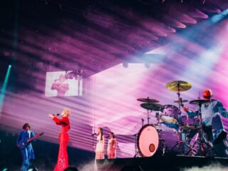
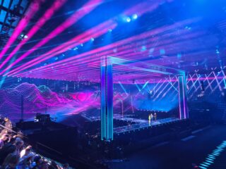
The Eurovision 2020 visual identity — things like how the logo is used on trams, taxis, mugs, etc — picked up the gold medal in the Integrated Identity Applications category. The logo itself won a silver medal in the Brand Logo category.
The logo was unveiled in November last year. It celebrated the past 65 years of the Eurovision Song Contest, acknowledged the 41 competing acts of Eurovision 2020 and paid tribute to past Dutch Eurovision logos.
The design represents the colours of the flags of the 41 countries participating in the now-cancelled song contest, in order of their first Eurovision appearance. The designers used special software to help create the logo, merging the colours of flags into the distinct design.
The 2020 logo also includes marks that represent the five Dutch Eurovision wins and it evokes the circular design of the Dutch Eurovision logos from 1970, 1976 and 1970.
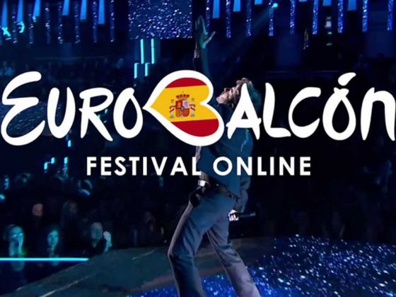
While Eurovision 2020 has been cancelled, the logo is still in use promoting the songs and artists of 2020, as well as the alternative Eurovision events.
Some fans would like to see the logo reused for the next edition of Eurovision, however with the logo based around a timeline that ends in 2020 and features the 41 countries of Eurovision 2020, the design would need to be updated to reflect the next Eurovision lineup.
Win Eurovision 2020 swag with #WiwiGiveaway
If you love the 2020 logo, here’s your chance to win some Eurovision swag emblazoned with the logo! Every day from now until May 16, we’ll be giving away prize packs featuring Eurovision 2020 merch, such as lanyards, keychains and magnets, to Eurovision socks, tote bags and baseball caps.
Head over to the wiwibloggs Instagram to check out the daily competition details!
But if you can’t wait and want to get your hands on some swag featuring that award-winning logo, you can also visit the official Eurovision Shop and make your purchases now.
What do you think? Should the 2020 logo be reconfigured for the next edition? What is your favourite Eurovision logo? Tell us your thoughts below!


Very well deserved. The best logo for years. I hope it remains, because it would be a shame not to use it. The motto could change, though, to reflect the post-COVID era.
I would just let it go. I’d create a colorful theme to celebrate life -and to pay homage to the lives of those who are gone. We deserve to sing and dance together again, and go on…
They need to adjust it for 2021 to incorporate the lost year, in some way
It would be a shame to not use it in 2021…
It’s a fantastic logo. Timeless, creative, symbolic, vibrant. I’m in love. Yes it looks similar to other circular things in the past, but last I checked, the wheel was invented in 3500 BC. Get with it. Noone owns the circle lmao, all the comparisons are ridiculous. Just another example of the great tradition of Dutch design. Part of me will be sad to see this logo go, but part of me is excited to see what else they could come up with. All in all, it’s much better than the last few years’. It’s a logo that really befits the… Read more »
I love the logo. Congrats!
BUT I have to say that from the first look it reminded me VERY much the city logo of last year host – Tel-Aviv
https://upload.wikimedia.org/wikipedia/he/e/e0/Tel_Aviv_New_Logo.svg
That logo was first introduced back in 2009 to commemorate Tel Aviv’s 100th birthday and has become the official city logo as of 2010. It symbolizes (quote):
“PLURALISM – Multi cuturalism, accepting and promoting those who are different”
Just saying…
Do you mean 1980 when you say the Dutch logos of 1970, 1976 and 1970?
I found this logo a bit too much at first, bit it’s since really grown on me!! I really like how it looks on shirts and vehicles, and was looking forward to seeing it animated in the show.
Can they reuse it? Be a shame not to use it, or have to go back to the drawing board. And a waste of money
agree! they should also keep the stage imo, they are both good designs and a lot of thought went to them so it would be a shame not to use them, they should improve the things they already have/had, so it it’s going to be the best show ever, because they can go into the smallest details.
Can we expect a big show next year? Are we going to be allowed 10,000 people in the crowd? Or will everything have to be scaled down?
I think till May the pandemic will go down. In fact till January doubt there will be any new cases since all European countries have a decline in cases. In Slovenia we have max 5 new cases per day so I can’t see going this much longer + an option of a medicine… but yeah u never know..
I think it will be scaled down in terms of audience capacity (maybe sitting 2-3 seats apart from each other and standing two metres apart, so instead of the 12.5/13,000 people they were going to let in instead they may only let in 4-5,000 people. The stage will still be on the same scale though.
Well deserved methinks.
I hope they will keep it for 2021. So it can grow two years long.