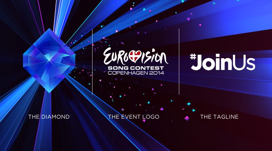
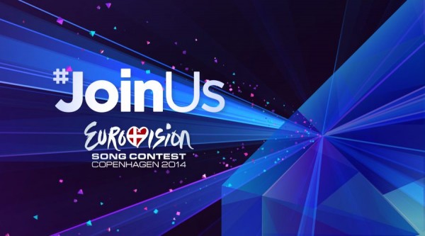
If you want to be on trend in Denmark, then leave your emeralds and rubies at home. This year it’s all about the diamonds! That’s right people. The Eurovision 2014 logo and artwork have been revealed and the diamond is the centrepiece of it all.
We’ve been listening to Rihana’s Diamonds ever since learning the news. As for Pernille Gaardbo, executive producer of this year’s ESC, she has spent the day dropping analogies. As she says: “The Eurovision diamond symbolises what the competition means to us: A hub that is at once sparkling and strong Diamond has lots of different sides and shows the diversity and the richness that will be on stage at the Eurovision Song Contest.”
But there’s more. Diamonds are found in the depths of dirty old mines. Apparently B&W Arena is just as gross. “[The diamond] emphasises visually the approach we have for the contest in 2014: The rawness of the B&W Arena combined with the sparkling show, and in the middle of the stage, the diamond as a unifying force, right where it’s all done.”
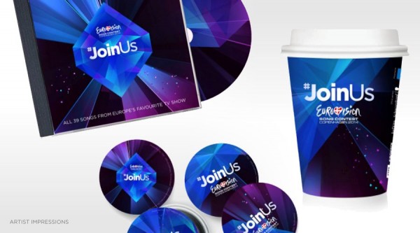
You can see all of the art work below. We love that they have mocked up a coffee cup!
Willy Lee Adams contributed this report from London. Follow him on Twitter @willyleeadams. You can also keep up with the latest Eurovision news and gossip by following wiwibloggs.com on Twitter and Facebook.






they’re trying too hard. what happen to simple, well thought of logos?
I like the diamond, but I’m not a fan of the #JoinUs tagline. I understand that it has to be simple, but it’s just too generic. Together with the diamond, it sort of looks like a Scientology slogan.
It’s ok. It’s not amazing or something we’ve never seen before. It’s not awful. It’s just ok. Yeah, this definetely proves that they didn’t put much effort into this. I mean, a diamond and “#JoinUs”. It’s predictable.
Anyway, the slogan was well picked. I think (like I always did in the previous years) that it will be an amazing contest. Even if there are a lot of countries that don’t take part. Good luck, Denmark.
Ok, this is the physicist in me but the one thing that bothers me is the light is refracted incorrectly in the logo. The rest is fine, but the way the light plays out is wrong.
Really Denmark?…so it’s official now, huh?. All of the “drop the hash tag” feedback you received from your trial balloon didn’t persuade you? Oh well, it’s just a logo but just the same…badly done Denmark.
I still think that #JoinUs is a mistake – every concert, sports event, raffle and local garage sale seems to use that on Twitter! Not unique enough?
The CD cover says “All 39…”. It’s probably a lie.
Er, I mean his skit this year. Feels like 2013 is gone already.
I don’t say this very often, but I’m agreed with Charles here. The slogan is by-and-large irrelevant. Unless somebody decides to say “DO YOU JOIN US EUROPE?????” on stage…
Also, they’re taking a page out of Erik Saade’s skit last year with the hashtag 😉
I love it, it’s beautiful!! But I think they should have chosen other colors than black and blue. Those colors were pervasive in previous series of Eurovision..
“I’ve never seen a diamond in the flesh …”
Not sold on the diamond — It’s not visually interesting, and why is it sapphire coloured? The symbolism’s fine, but a faceful of monochrome polygons and light beams — inevitably panning and zooming for 3d effect — is a bit primitive. Expect kaleidoscopic video cut-ups as about the only graphic use for it. One can only hope they have better ideas for it.
The tagline on the other hand is among the best for sending multiple messages in the most innocuous and inviting guise. Much better than “We Are One.”
It’s beautiful!!!!!
Yikes! Even the JESC logos are better. Btw last year’s butterfly was meaningful and pretty – this here is just plain and cheap looking
Diamonds may be forever but they make for a lousy logo.
The logo looks even cheaper than last year’s butterfly.
From a butterfly to a diamond … I just hope the music in the contest is worth our ears …