Late last year, the new logo for Eurovision 2021 was unveiled. Now the EBU has revealed the new branding for the Rotterdam contest, with the additional design elements that will brighten up Rotterdam in May.
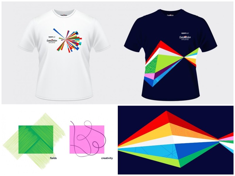
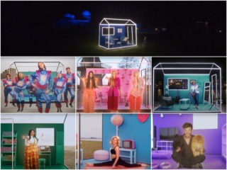
The colour palette for the 2021 branding is based on the flags of the competing countries, mostly primary colours. But they’re also joined by the bold secondary colours bright green, pink and purple, which the EBU says emphasises festivity.
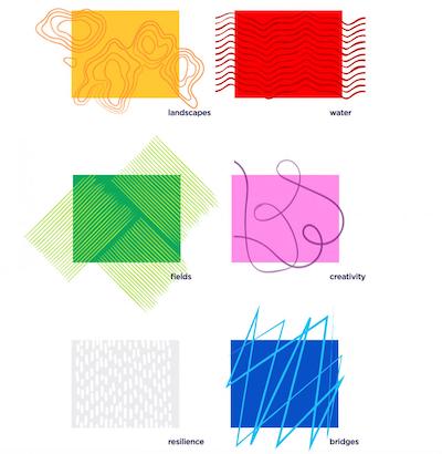
The branding also incorporates six patterns that represent features of the Netherlands: landscapes, water, bridges, fields, creativity and resilience. And not a windmill to be seen! These features are sure to resonate with people from outside the Netherlands as well.
Eurovision 2021 branding will feature the Track
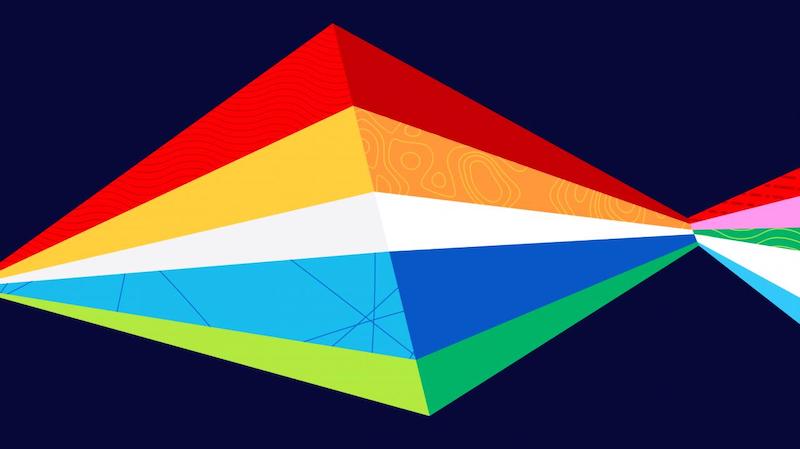
These patterns will be used in backgrounds and in another part of the 2021 branding called the Track.
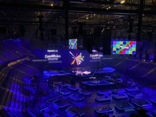
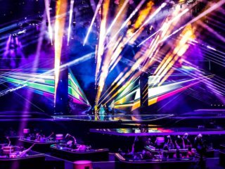
The Track takes its cue from the rays of the logo. It is made up of a number of triangular shapes which together form a long pathway type of design. The EBU says it’s based on the “symbol and perspective” of the Rotterdam stage design. The stage was designed for Eurovision 2020 and will be retained for the 2021 contest.
The design of the Track isn’t fixed. The EBU says the design can be adjusted in many ways, as long as the overall rhombus shape is kept.
The Eurovision.tv website has already been updated with the new branding. It will be seen outdoors around Rotterdam, as well as on television and on merchandise such as coffee mugs and T-shirts.
The logo for Eurovision 2021 was designed by the Dutch agency CLEVER°FRANKE and is closely related to the original logo for Eurovision 2020. The 2021 design was created from data based on the location of the participating countries in relation to Rotterdam. The design also uses colours from the flags of the countries.
Dutch digital companies NEP and MediaMonks joined the design team to make the new branding accessible on any platform — physical and virtual.
What do you think of the Eurovision 2021 branding? Will you buy any merch with the new look? Tell us your thoughts below!

In my opinion the design has been improved this year. The rainbow track reminds me of an abstract version of tulip fields that can function as an additional theme in many different ways. For announcing the postcards or interval acts for example.
I have to be honest: I’m sort of confused. Is “the Track” a sort of alternate logo? I really like and if I were in charge, I’d leave that as the main logo, since it conveys a fresh new start. It’s hard to explain: That design is simple but it’s so fresh, lively and transmits so much energy. I also loved the patterns, simple as well but without cliches. That reminds me of all the parallel logos of Lisbon 2018. What a beautiful surprise for this weekend!
I don’t like it 🙁
Why?
Brilliant! The design looks more mature than last year.
As a graphic designer, I’m impressed! This is the embodiment of pop art at its best, so colorful yet so European.
Agreed, they did a great job.
I have a question related to the design and branding of this year’s Eurovision Song Contest – what kind of font do they use this year? Can it be downloaded from the internet?