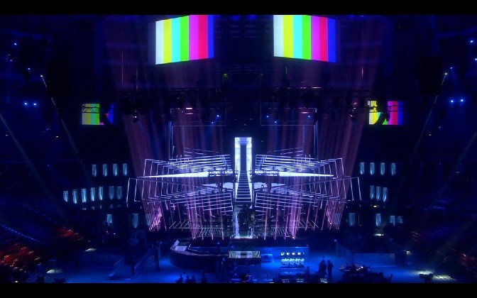
LEDs and lighting, it’s getting exciting! After weeks of work and months of planning, the Eurovision 2016 stage is finally ready inside Stockholm’s Globe Arena.
SVT have uploaded a few videos that show the stage in full motion, serving some wondrous light displays. With hints of Melodifestivalen, it’s quite awe-inspiring and the artists will no doubt love singing and dancing on its LED floor! You can develop your own first impressions here and in the video below.
It’s obviously too early to have a fully-formed opinion yet. The stage is rich and complicated and filled with countless layers, lights, LEDs and other tricks, which we won’t see on full display until rehearsals begin.
But it clearly has immense potential, and acts with optical illusions will no doubt benefit from all the magic.
Designed by Frida Arvidsson and Viktor Brattström, who also produced the stage for the 2013 Eurovision Song Contest in Malmö, it includes an army of lights and LED walls that break open to allow artists to move inside of it. This stage is alive.
The arena has also moved in recent weeks, with the ceiling falling by four centimetres since work on the stage began. That’s because producers and technicians have used 65 tons of equipment in the construction, which has pulled down on the roof just a tad. The Swedes were serious in 2012 when they said we’re going up, up, up, up…that equipment is literally sky-high!
Want to see more of the stage? Then follow Eurovision Diary 2016, a cool blog run by Ola Melzig, the Technical Director of Eurovision 2016 and the head of M&M Production Management.
What do you think about the stage?
Photos: Courtesy of SVT/M&M Production Management/Ola Melzig





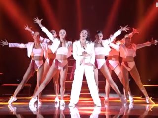



Feels like that stage was made for entries like Russia.
That looks AWESOME, can’t wait already. 🙂
🙂 Better than last year! Austria threw an amazing show with quirks but this year’s really takes the cake!
I don’t like it. It’s like Melodifestivalen going big, and that is not necessarily a good thing.
Nothing beats Denmark 2014.
so many layers, so many lights… idk where to look. 🙁
Toooooooo many lights ,not very Impressive , they always seem to use dull colours, Always blue and purple, Might be wrong I hope so. we will find out next monday when the rehearsals start,
The stage itself is an optical illusion of depth, which is a genius touch by the Swedes. The stage is still huge so I guess most shots will be wide, hopefully we get some close ups too cause its what makes the emotions of a song transmit to the audience
AH-MAY-ZING!
Georgia’s stand-in rehearsal in that picture “Midnight GOLD” 😉
Wow. Love it. Love seeing the stage in motion.
… However it also looks like a giant spider. Which I’m not so keen on.
Wow! It looks amazing! 😀 <3
Beautiful. It looks like this scene was created for the Cypriot entry. They will rock the stage! It suits perfectly. I totally can imagine it. Gonna be freaking impressive.
This stage reminds me of alien movies xD
It’s kinda like a spaceship xD
It just doesn’t look as warm, comforting or even as classy as Malmo did.
Looks awesome!
Fantastic job. It’s getting excited indeed.
We are going to bring you the best Eurovision ever 😉
Beautiful. Btw it looks like this scene was created for russian entry. It suits perfectly. I totally can imagine it. Gonna be freaking impressive.
Wow! What an impressive stage! Nice work Sweden! Stockholm will look amazing!
It’s already making up for the mistakes made from Malmö 2013. Looks awesome!
The stage is roughly one meter higher and wider than last year, but more than 10 meter deeper.
More is more…espectacular
This is sooo cool. https://twitter.com/jovit_31/status/724660443164344320
Now that’s a stage
Love it so much!
That lower number of “crystal” lights on the right side really irritates me!! 😀
“LEDs and lighting, it’s getting exciting!” I see what you did there…
Dope
@Goodnightmoon – I was thinking maybe Montenegro, but nah, they’ll just do some strobe lighting and this looks quite tasteful, so it’s probably Douwe Bob
I just hope the music and the singers will still be the point of attention, not too much light-show and stuff…
Probably the best one ever, the feeling of depth is an absolute geniality.
@Österrike Me too, just a guy with his guitar. Who else these year has it?
Wow, it’s amazing.
So, with those couches there, does that mean the green room going to be right down in front of the stage? Does that mean no giant crowd with 50,000 flags blocking the view of the cameras?
another one. I think that’s either for Czechia or Armenia, or maybe just for a bridge in a different song. Still, I always find this angle of lighting impressive
Eurovision may even exceed the WWE when it comes to the aesthetics of staging. Can’t wait to see this baby in action!
I think the results of this year will be the 🙂 http://www.youtube.com/watch?v=2D_1Q5sBEGM
Why it is asymmetrical as there is lower number of “crystals” lights on the right side of stage.. I hope they will add them as it looks quite stupid now.. The catwalk is also strange and look like it had not been part of original design.. I would prefer if they just lengthened the central part of the stage.. However it looks very promising.. I like it..
This looks so much better than Malmo’s outdated cave !
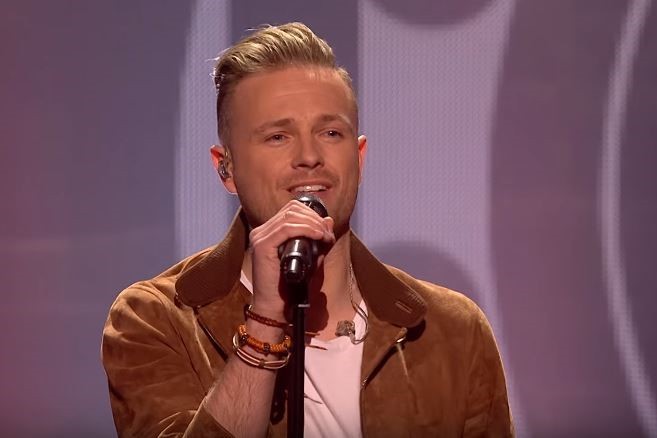
I guess the stand in is for Netherlands.
Looks scary, like an intergalactic monster with laser eyes that vaporise you instantly and with razorblade sharp shards that form the face. Ready to chop the audience. Already Malmö looked like doomsday Gates of Hell (no surprise “l’enfer et moi” opened the final).
The stage does not look cosy.
Looks amazing! The Swedes never disappoints