
On Tuesday the Eurovision 2023 semi-final allocation draw takes place inside St George’s Hall in Liverpool from 20:00 CET (19:00 local time). It will be broadcast on BBC Two and BBC iPlayer in the UK, and on the European Broadcasting Union’s Eurovision YouTube channel.
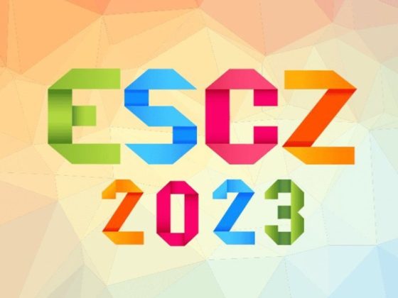
And ahead of the big day, the city of Liverpool has dressed the building, revealing the Eurovision 2023 slogan and theme artwork.
The logo is a series of small hearts that create a vortex of love. The colours, we can assume, will change throughout the show to reflect the various participating countries.
The EBU-run Eurovision web site described it like this:
“The colourful ECG (electrocardiogram) effect produces a string of hearts, each one responsive to rhythm and sound, to illustrate the collective beating heart of all Eurovision contestants and viewers alike. We are all ‘United by Music’. And the typeface used is called ‘Penny Lane’, inspired by the twentieth-century cast-iron signs displaying Liverpool street names and a nod to the city’s rich musical heritage.”
Martin Green CBE, Managing Director, Eurovision Song Contest 2023, at the BBC had this to say:
“The 2023 Eurovision Song Contest will be a truly special event and the creative look is a big part of creating that magic. This year’s identity sums up perfectly the amazing partnerships across the Contest and more importantly the power of music to bring people together across the world.”
Inoffensive and mildly inspirational, #UnitedByMusic does the job as a #Eurovision slogan.
— William Lee Adams (@willyleeadams) January 30, 2023
But the real treat is the logo — an infinite series of hearts coming together, each one impacting the next. Will look great in motion as it morphs to reflect flags of various countries. pic.twitter.com/NLii8KTkAE
The design is a partnership between two agencies: Superunion in the U.K. and Starlight Creative in Ukraine.
Superunion’s Executive Creative Directors Stuart Radford and Katherina Tudball said:
“We are thrilled to create the 67th Eurovision Song Contest visual identity in partnership with Ukrainian agency, Starlight, and the BBC. For this year’s theme, United By Music, our solution was inspired by research showing that when experiencing live music together, human hearts synchronise to beat in unison. This insight led to the creative concept of 160 million hearts beating as one, an idea that captures the universal spirit of Eurovision.”
Olena Martynova, CEO, of Starlight Creative said:
“Creativity and music both have the power to unite and inspire. We are so proud to be part of the creative concept for such an important musical event when more than ever, we need to come together as a global community. For Starlight, it is an opportunity to represent Ukraine on an international stage, showcase our creative and musical ability, and create something that honours our strength and the power of unity.”
Outside @SGHLpool as it’s being dressed for the #Eurovision handover show tomorrow. It’s starting to get really exciting for Liverpool ?https://t.co/wtvwSu9JdA pic.twitter.com/Bxyaa5lOs0
— The Guide Liverpool ? (@TheGuideLpool) January 30, 2023
Fans got their first taste after The Guide Liverpool uploaded a video of the hall being “dressed” with “what could be the Eurovision 2023 slogan and logo,” according to their reporter.
Shortly after the video was published, the official Eurovision account tweeted that “Liverpool’s got a brand new look” and Rylan, co-host of the semi-final allocation draw, tweeted a pic of himself in front of St. George’s Hall, adding: “Here we go — Eurovision 2023 kicks off tomorrow! As we are all ‘United By Music’”
What do you think? Are you happy with the graphic art and slogan? Let us know down below…


Would this be one of the few Eurovision themes that is not dark-backgrounded? (Baku 2012 was red and Lisbon 2018 was light-aquamarine). That’s a really great choice to use a vivid, lively background color in years!
I like it all but I wish the BBC would stop putting presenters on display for every single element. We don’t need Rylan Clark pointing to the slogan, we can see it!
Good choice of colours. Also the logo seems good. Regarding the slogan in theory it makes sense: because it is organised by UK for Ukraine and music should unite it. But it is a clear reference to United Kingdom, so I am not sure it was sensible to cite in the slogan just one country!
Will the UK’s place in the final be decided tonight I think it should be because we are paying for it if it wasn’t for our country they wouldn’t be a contest this year
Usually yes, I assume Ukraine will be drawn their spot in the running order for the final too.
nope
that’s on march, at the delegation meeting
We would just have found another host country
Gotta say, I like it! I feel like it’s a bit of a mix between the 2011, 2017 and 2022 logos, as it’s a string of hearts that each move like sound waves. I think the slogan is nice too. Not too exaggerated like “The Sound of Beauty” or “A Modern Fairy Tale” etc. I’m looking forward to the event in Liverpool!
The story behind it is nice and it looks AMAZING with animations
I don’t love it but neither do dislike it. It seems the graphics world is moving towards a clean sleek trend with more classic colours ( a bit like Paris / Junior Eurovision) which this seems to deviate from, so maybe my feelings are more to do with expectations. But lets wait and see how these still images translate to motion images.
I’ve often felt the logo and the actual stages don’t match where there could be more cohesion. But, I hope we don’t get a heart shaped stage
You were right about the 1998 logo, I must have been thinking of the 1999 one. Both are kinda unimaginative though. BBC added a star to the EBU logo.
*On social media I noticed some people from a quite specific country who are acting ruthless over this design just because of last year’s negative reception… So a little message to those ones, stop holding grudges and move on. Not everyone will like what you do: è triste, ma questa è la vita… It ain’t that deep and y’all come across as bitter.* Now, let’s get back on the subject: I for one really love this, it’s coherent, cohesive and the idea of unity is strongly present throughout. Visually combining two cultures into one while finding common ground between design… Read more »
watch everyone dramatically cry about it, the logo is like the least relevant part of eurovision, yet everyone likes to start kicking and screaming about it. we all know you’ll still watch and forget about it as soon as the show starts.
I disagree. I think it’s essential: you can see it anywhere! It’s each edition’s identity. Besides, it’s a ley part of a series of milestones throughout the Eurovision year!!!
Well… so when will the stage design be revealed? I can’t wait to start imagining the performances there.
I wont be surprised if this logo was intended for pride month.
It looks like it was put together in a rush with preconceived Eurovision as gay-fest and whacky.
we all know you’ll still watch, watching supports pride, so technically you’ll be supporting the “gay-fest” cry a bit harder
Now Ken Bruce has quit Radio 2 who’s going to take over from him doing Eurovision
My guess is Scott Mills? he only commentates on the semi finals for TV, so perhaps he will hang around for the radio commentary, maybe Ryland, or possibly both
When it comes to the logo it’s fine but why do we need logos
Otherwise the graphics and promotion would be same year to year, this is why every Olympic game has their own theme too.
All the people in the world do we have to have Rylan Clark on Eurovision
Um yeah he’s been involved with Eurovision for years now.
Becurse he has done an amazing job in the last few years, he’s a supporter of Eurovision and knows his facts.
we all know you’ll still watch lmao
Why do we have to have Rylan on Eurovision he’s the most annoying TV person on TV and the BBC gives out TV licence money to that idiot
Quite generic… but pleasant
United and heart and strong national colours of Ukraine in the mix. Eurovision statement clear and precise.
When somebody said: “Can we put up some generic promotional artwork before the draw tomorrow?” 🙂
I’m kidding. I actually think it’s very functional. It gets to the heart of the matter.
I have no relation to logos or artworks what so ever! It does nothing to me. They might as well just get rid of it all together. They did not have art or themes before 2000 and the contest worked fine without it..
That said, the colours are nice and if you look closely it is both UK and Ukraine colours!
They did have logos before 2000, some very good ones.
Exactly. They had everything – art, themes, nice stuffs… Denis is just too arrogant to see past his board.
Arrogant? LOL..
And you are nice I suppose.. Seeing how you call random people online arrogant I bet you are a really nice guy
Go to the Swedish Wiwi articles and make Sweden again an 8th World Wonder, please.
I mean… it’s OK but I’ve definitely seen better graphic design over the years. Idk it just seems a little bit too simple? While Italy’s slogan and art last year felt a little bit too messy and overcrowded, this year just sort of feels like the generic Eurovision theme that the Eurovision YouTube channel uses between seasons and I don’t know which I prefer. I do like the colour scheme though, the mix of pink, blue, and yellow works surprisingly well. I mean put it this way, I’m not creative enough to even THINK of doing graphic design so I… Read more »
It’s a logo get over it
I never really care about these, so fine by me.
To all the people who are complaining: why don’t you make a better slogan and design.
The slogan is simple yes. But simple isn’t necessary a bad thing.
The majority of people in this comment section could probably design a better slogan and artwork.
Slogan – probably. Design – yeaaaah, no. As someone who does graphic design full time, when someone says they “can design it better”, I just sit them down and open Adobe Illustrator. They have no idea what they’re looking at. Scribbling something on paper – maybe, but that’s 0.1% of the work.
I’ve seen Redditors and fan accounts on Twitter design better artwork than this. Search some up so you can see yourself.
The BBC has a huge budget, their design should be the best of the best.
Depends if they can make it move around and make them into a variety of visual materials such as chargen, fillers, and bumpers.
Give me an hour on canva and I’d have you a better design
All of a sudden everyone’s a graphic designer! Lol
I think this is simple and conveys its message perfectly. What else do people want?
The font is a weird choice- very road sign and ESC 2006
It’s called Penny Lane Bold. Hardly a weird choice cobsidering its connections to Liverpool
Talk about lackluster, what the hell is this?
Let’s hope BBC’s budget went to stage designers & hosts, because they clearly just hired a graphic design intern and cheap creative team for the slogan/artwork.
so yall wiwi gon ignore the greek representative that just got announced
Probably writing the article right now, as we speak. it might show up today or tomorrow.
Looks like a logo fifth grader comes up with for school’s project. Super boring
Considering the logo and the last song that have been choosen (Belgium) it feels like something in early 2010’s and considering the logos and the songs 2015,2016 etc. seems more 2023. And 2023 doesn’t feel like 2023.Why so basic.. We are almost in the middle of 2020’s era and why everything is dated
aww the little hearts and hidden ukraine flags
It kind of reminds me of 2017, which was in ukraine
Excited that the contest will take place in the UK. However, the slogan is kind of basic. I mean any teen student in an essay would pick that one. The hearts logo is nice though.
It’s straightforward though and the pitch doesn’t have to be elaborate. 🙂
Colours of the logo somehow reminds me of MTV VMAS logo, and heart-in heart shape reminds me of PowerPuff Girls intro.
Lol
I didn’t expect much from the UK and they didn’t disappoint! It’s poor, lazy and basic just as their theme artwork was in 1998!
The Slogan is meh, but nothing is worse than last year’s lol. I like the colour pallet tho I don’t get it? Why black and magenta? Why not red, white, blue, yellow?
Yeah, wonder if someone got paid to come up with that?
omg can you imagine? Quickest money made.
Probably another of Johnson’s cronies in exchange for free wallpaper and flights for life on Ryanair
It’s based on the color palette of the Ukrainian flag colors.
Imagine if Magara win ESC and the black and pink was a sign all along.
I know they won’t even be at ESC lmao but it’s a fun thought.
Never say never 😉
I always doubt my favs lol.
As you should, never good to be too confident.
I’m never too confident haha : )
two countries that are not in political Europe and do not participate financially in European unity are organizing Eurovision! a nice contradiction, a prize for brexit!
So what would you say about Switzerland or other countries who never wanted to be part of the EU? At least the UK gave it a go?
Switzerland has been and is consistent, Great Britain has served its interests by using Europe as a bus, after they took billions of euros in funding they left. Britain was the only one of Europe’s Big 5 countries that was given preferential treatment to stay in the European Union, and in the meantime it was taking more funding money than it was paying. France or Italy paid more money than Britain!
That’s a lie. The UK was one of only 10 net contributors into the EU budget, second only to Germany. France was at the time 3rd, and Italy 4th. The UK has never been a net beneficiary country when it was part of the EU. Furthermore, the EU has NOTHING to do with Eurovision. So don’t make up facts to push a xenophobic agenda on a podium that was designed to bring people together. It’s tacky
WTH? Go to sleep and we will wake you up for San Remo as always the only thing that interest you here.
There really are some commenters that need to get banned lol.
you need some history lessons and few fact checkers
Eurovision is not about European Union. It was actually launched even before EEC was created. So Brexit has nothing to do with it. Britain remains one of the most important and influential countries of the continent.
No, it doesn’t.
Oh look it’s a local
I do not like it, but that’s okay. After all the bad things that people said about italian television, starting from the logo, i hope that the community won’t attack this year’s production. Hosting Eurovision should be a moment of joy, and something which can shows people’s identity and a different point of view of entertainment, design and tv hosting. So, let’s just enjoy this year’s contest!
I was thinking of “Beyond the Reach” or something. The slogan is not too bad, though. What I don’t like is the theme artwork. The colours are somewhat unappealing and look dated. Oh well, have a very merry vision!
Or “I’ll Protect You From The Hooded Claw”
Very nice! At least some thought was put into it (the “Claw” slogan).
I admit I’m not feeling this one – the slogan is ok, but the logo is making it a bit cheesy. At least the colours are nice.
A slogan containing the term “United”, for the city of Liverpool? #GGMU
Manchester is quacking.
Reminds me of a twitter post on an AI generated slogans, this one could be too.
Tomorrow, in addition to semifinal one of Benidorm Fest, and the semifinal allocation, we’re going to find out who is going to represent Austria! I don’t know if it’s just the artist or if we’ll get a song too, I can’t wait.
I like the slogan, but the logo just looks childish and too American. I miss classy artworks.
Under the same sky (2004)
Celebrate Diversity (2017)
We Are One (2013)
These were my favourite slogans and my favourite logo would be probably 2021, and this is not even close
“Under the same sky” and “All aboard”!
Off-topic: Princess Hours or Coffee Prince?
Wow Thank you for recognizing and i’d say coffee prince
Those slogan are basic
I don’t get it.. but ohh well.. it is just a theme artwork..
I like 2011, 2016 & 2019 arts better THO…
He didn’t forget to mention 2019, of course…
Oh I can’t wait for march.. a storm is coming… OMG I Can’t!
And it will come especially after most of the songs from the other countries are revealed, it’s genius! I am so happy!
As if it had an impact lol, but anyway be happy if you want.
I actually quite like it
United as One would have been better slogan.
Ukraine 12 points would have been the realistic slogan xD
And your pseudo should have been Karl the bad spirit. Everywhere everytime negative, sarcastic, mean, never satisfied, but find another passion it would be better for you.
“We are one” was already used in 2013
Which just shows that this slogan thing should have been abandoned long ago.
Or United Queendom
As much as the sound of beauty was mocked, when it was first revealed, it was an original slogan. United by music does sound a little trite to me, but I was expecting the word “united” to be included in the slogan anyway, so I’m not surprised. The main color seem to be black, blue, yellow, and magenta (?). It seems like the colors are reflecting, the color schemes of the Ukrainian and UK flags, but I wonder if magenta is used instead of red because it doesn’t feel strong and threatening? Or is it bad lighting? Well, we’ll find… Read more »
Last year the slogan was….a choice. beauty of sound would have been more relevant imo, but the past is the past.
I think the slogan I had in mind was “United through Music” and this is pretty close, so I was just off by one word
Good intuition !
Sound Of Beauty was the worst slogan yet imo lol. I don’t like this one either at all but the colour scheme is nice imo.
I think All Aboard is probably my favorite slogan.
I like this one, Dare to dream and Open Up were iconic imo.
Yeah, all aboard is a great slogan because it invoked Portugal seafaring past and it was also a welcoming slogan for all countries to go all aboard to Portugal.
The Sound of Beauty didn’t mean anything they couldn’t even explain it when they tried.
Blue and yellow are quite dominant… I was hoping for more UK identity. I guess the postcards will show videos of the ruined cities, that will bring us to mood for some light Saturday night entertainment.
Yeah, it’s annoying.
If it annoys you so much, don’t watch it, don’t follow it, nobody obliges you.
If they will tie in Ukraine in the postcards, I am sure they will show more positive moments in Ukraine, or of Ukrainian people in the UK. After all, Ukraine was the winner, so it is only fair for the theme to be more Ukraine oriented. After all, Ukrainian people need some positivity in their lives, to help take their minds off the war, their home being ruined, losing their loved ones and everything else. Not withdrawing from Eurovision last year was the right thing to do – Ukrainians had something to come together to and have an enjoyable evening.… Read more »
I’m a sucker for yellow, I can’t be more satisfied, nice job, as already said but in motion it will look fantastic. I prefer bright logos rather than dark ones. It incorporates the ukrainian flag which is more than legitimate. The slogan refers to the United Kingdom. It’s cool and I like it.
😉 and at least no brown or weird orange this year.
Same!
Me too. I am a very happy person.
Yeah, I think the yellow is a naughty Ukraine and the magenta seems to be like a variation of red to represent the UK and both flags containing the color blue in them.
What the hell did I write? That should say a nod to Ukraine, not naughty. I hate dictating through my phone.
Two of those three hosts from Ukraine 2017 seemed very naughty to me
This will be the first time the contest will be in the united kingdom. Up to now, it’s been in the united queendom. Charles is thrilled.
Ohhhhhh, I get it now.
Kind of dull and seems like the first thing someone came up with. I prefered the ‘Sound of Beauty’ from last year!