The EBU has confirmed that the Eurovision 2022 slogan is “The Sound of Beauty”.
The confirmation comes a few hours after an image emerged on Twitter, showing a banner with the slogan and logo, prompting countless shares and comments on social media.
The EBU writes:
“The inspirations behind the Eurovision Song Contest 2022 slogan and theme art, and information on how the Contest’s new identity informs and inspires everything from the merchandise to the ambitious set design, will be revealed on Monday 24 January.”
The slogan “The Sound of Beauty” lends itself well to a musical event. Producers will be able to ask fans what beauty sounds like to them. There’s also a quality of synesthesia at play — when one sense overhwhelms or comes through another, as when you see colours while eating or hear what you see.
As for the logo, the circular shape will connote many things to many people. On first glance it might resemble a solar eclipse, bacteria, a planet with corona light effect encircling it, coronavirus, the pupil of an eye, a molecule or even a uterus.
What do you see in the logo? And do you like the slogan? Let us know down below!
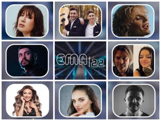
View this post on Instagram


The logo of JESC2021 was 100 times better, please
I am shocked by the vast number of negative comments here. Of course, tastes are tastes and there is always room for discussion and thats fairly ok. But the RAI and Italy bashing is simply outrages. I am not Italian, but I am sure Italy is going to stage one of the best shows we’ve seen for dacades. It is certainly going to be unique and particular, with soul and life. After rewatching all the 1990s editions, I find the 1991 ESC to be yes quite chaotic, but that’s what made it so special and rememberable. It simply had soul… Read more »
It is funny how things in English sound more or less ok but when translated into different languages sound soooo corny.
In Spanish El Sonido de la Belleza. (The sound of beauty) sounds like the title of a Peruvian soap opera.
I thought Moroccanoil was a Moroccan petrol company but it actually is a company that sells hair products.
I’m glad I’m not the only one who thought that! ?
Italian design simply never disappoints! I LOVE IT!!!
When you aren’t sure whether it’s supposed to look dated or not, then it’s pretty bad either way.
I think it’s all quite ugly, but I hope it grows on me and everyone once we see the full concept (animations, flag colour versions, merchandise theme) and we get used to it.
So far it’s very disappointing and doesn’t even fit the modern aesthetic of the graphics they’ve used on the official website and social media channels.
The slogan is extremely dumb IMO, but I really like the design and can’t wait to see it in motion.
It’s the opposite for me. I don’t mind the slogan, while I find the logo extremely ugly and uninspired. Very early 2000s not in a good way, messy.
I also don’t get how the sponsor’s logo is allowed to be as big as Eurovision’s own logo?
I couldn’t agree LESS!
I like it. It reminds me of spirograph. Did no-one else ever have that toy?
I think I had it but I was too little to remember even its name uwu
Eurovision is too serious for me to be involved with toys. I think I had one, but I never paid much attention to it. Drawing cars by filling in lines of some plastic that you moved for several steps. I loved those because it felt like magic!
I like it, it is certainly not over-ambitious.
I’ve never seen a post like this with so negative comments; it makes me really sad. No one at this moment seems appreciate how Italian delegation and our broadcast is working on the show. Please be patient, and trying to not judge everything based on what we have right now – just a slogan and nothing more.
Really, it’s just a logo/slogan. If I think back to what made Rotterdam successful, the logo and slogan barely register with me. I’m sure Italy will do a wonderful job like the Netherlands did.
The ESC fandom are always overreacting, dramatic and quick to jump to conclusions, It’s like this almost every year. I’m sure you’ll put on a great show, and in the end that’s what people will remember.
Even if the comments are bad, the logo and slogan are the least important parts of the show. It’s just there’s nothing else to discuss so people are over reacting. Prepare yourself to hear 1000000 times that the stage is too small and that the camera angles are too wide.
Don’t worry Mirko. Unfortunately, it’s not given that people understand and appriciate good taste and pure class.
What I appreciate is blue not being a dominant color in the logo. I think the last time this happened was 2015. I appreciate and actually the logo looks like an eye to me. the circle being the pupil and the waves being music or light. like seeing the beauty of music.
The Graphic is very ugly, it resembles Covid sign. The colors are horrible. It looks very cheap and amateurish. Who made it? Although I was glad Italy won, I’m very disappointed by how they’ve organized things so far…
What you mean organized so far??? Nothing happened yet…!
The logo is based on soundwaves coming off of speakers, which sometimes, visual effects artist would make a visual representation of by showcasing a beating circle that emanates sound waves and every beat it does is a response to the beat of the music.
https://pbs.twimg.com/media/FJsdu6uWUAEnmt0?format=jpg&name=small
We can discuss all day long about whether this logo is bad or genius. But for the first time in a couple of years, i can really see that the countries identity has been incorporated into the slogan and logo – which have been really missing. Turin 2022 here we go!
The first time in years? I’m a bit confused about that. “Open Up” was related to the Dutch cultural climate where people of different religions and (artistic) backgrounds have been welcomed, and seeked refuge for centuries. The logo was inspired by the straightforwardness and simplicity of the Dutch culture (can be seen in De Stijl art/architecture). The stars of 2019 obviously were related to the cultural and religious identity of Israel, related to Judaism. “All aboard” had to do with the nautical character and culture of Portugal, and the century of oversees exploring. When I look at the 2022 logo… Read more »
Because if you read “open up” or “all aboard” you would immediately think at Neatherlands and Portugal? Come on, the “sound of beauty” refers to the “bel canto” which is notoriously italian… it’s okay if you don’t like the idea but the reference is clear
Eh… no. The reference isn’t clear at all. Then they should have made it ‘The beauty of singing’.
Ehm sorry, I like the “sound of beauty” more, the sound of italian beauty… of italian language
You make it sound like Italy somehow has a monopoly on beauty… like if we hear the word ‘beauty’ we immediately think of Italy.
Of course not, but I find this slogan to be very much appropriate to the host country… also I don’t understand the criticism, many of the past slogans only refer to the feeling of unity, which is honorable and follows the aim of the competition, but they are really generic, this year there is a slogan that actually makes sense but apparently it’s not enough, what did you expect “pizza mamma mia”?
Well, you’re kidding but actually I would have liked that one much better… at least it evokes a reaction (laughter) which is what you want with a slogan.
Eh? Italy is known throughout the world for its beauties. Life is beautiful and The Great Beauty are two Oscar films that were made in Italy. If you fail to see a connection on “beauty” =/= “italy” that is so crystal clear…
Careful not to pull a muscle reaching like that.
I’m underwhelmed, it’s not my idea of a logo, it’s not clever or cutting edge and like other posters here have already mentioned the sponsor’s name is far too prominent. With regards to the stage, it sounds far too complex and messy given that most of the set changes for each country over the last 15 years or so are done with lighting and imagery, it actually doesn’t need to be as big as it is as there are only six people allowed on it at any one time, I’ve been to a few ESC’s and in most cases the… Read more »
So Ugly! I remember how beautiful the 2012 logo looked, so far from this. It’s like comparing Trash bag to Luis Vuitton handbag, ha ha!
The colour scheme looks horrible!
They are musical waves that float in the sky all disorderly of various colors that then come together and form this star-shaped design with the colors will also form the nation. For example, for Italy they will be green, white red.
Most design concepts work on a logo first and then create the animations and concept based on the logo. Here it seems Italy might have done the opposite. It feels like they thought of the movement of the concept first, just like how sound itself doesn’t have an image but it always vibrates (moving) and then they had to implement that somehow in a logo. It just doesn’t happen, or at least not as successfully and that’s what most people see here. So let’s wait till Monday when the whole design will unveil itself and we will be able to… Read more »
Flags are easy to distinguish when they are drawn or laid flat. Once you hang them and let the wind do its thing they can become indistinguishable. Would you stretch and deform them so they are only readable when they are in motion?
As Erik said below – a logo has to be simple and recognizable and you should be able to draw it yourself. This simply isn’t a logo.
The logo for a Eurovision is usually not a logo, it’s a concept. Like letting countries be represented by a seed, a pearl or similar. For a logo we can look at the Olympic Rings. Five connected rings. Easy to draw yourself on a pice of paper. Recognisable. Or the McDonnalds M. A logo should be just that. Easy to draw, recognisable. We have the treble clef of 2008, the heart of 2011, the butterfly of 2013 and the star of 2019. These are close to being logos. The rest are just concepts. They are too complicated to be drawn.… Read more »
More like the sound of recorded voices lmao.
The logo is probably seventies-inspired, looks like a kaleidoscope. The slogan is just plain bad, but who really cares about the slogan.
Btw, I think Moroccanoil is a bit too visible in everything Eurovision. For a show that’s on public broadcasting in most countries (I assume) it’s bordering on illegal how much prominence this brand gets.
‘The slogan is just plain bad, but who really cares about the slogan.’
Well, normally the slogan works as a concept for the postcards and interval acts.
You can do pretty much everything with this slogan, so that shouldn’t be a problem.
It looks retro, like it was a logo from 20 years ago. I like it though, it brings me nostalgia.
Also FINALLY a slogan that doesn’t speak about everything being one diversity stuff…
È la cassa di uno stereo hi-fi che pulsa… ignorante.
It looks like it was made by an undergraduate graphic design student! FAIL
Am I the only one who’s seeing Covid in the logo?
The circle reminds me a woofer, so I guess it’s going to get sense when animated.
Very dissappointed though, considering that italians are famous for design, so I’d have expected something different and more original
In the printed banner the colours look kinda nice actually. Don’t shoot me XD
Why is the “Turin 2022” smaller than “Song Contest” in the main logo? It’s driving me crazy.
It always is. It’s in the guidlines.
No I don’t think it was in the previous contests. Check Rotterdam for example. Song Contest is in bold yes, and the City name is in regular/light, but the font size was the same. Or am I being crazy?
Well perhaps the city name has always been slightly smaller, but this year is too much. You can barely read it.
The slogan is sugary, the logo is dull and uninspired (is it a logo even?).
I’m afraid they are going for a vintage style approach in the whole show, like a San Remo festival of the 50s, given the description of the stage too.
The symbol looks like a circle with a weird papery aura around it
This gives me 2011 vibes lmao
The typeface reminds me of the ones you’d see in trailers for old coming-of-age Italian films set in the summer (Summertime!).
The font for the slogan actually does look like something out of the 70s
The slogan is perfect. The logo needs to be redone. ASAP
Why does the sponsor name have to be so big? EBU, this is your fault!
I personally don’t like the logo. I find it dark and dull. The idea behind it is not bad but I just don’t like the selection of colours.
On the contrary, I love the slogan 🙂 (one of the best ones ever for me)
At least it is less blue than in the years before, but again a circle.
“The beauty of sound” would have been better slogan.
Some sound are just noise.
My inner Merzbow fan is both flattered and offended.
The logo is… not what I expected. I’ll reserve further judgement until Monday though when they reveal the whole design concept including the stage.
The wisest approach. Let’s at least see the stage concept and hear the designer explaining his idea.
It’s totally fine if you like the logo. I just can’t understand the people making excuses and saying it’ll look better animated. The first rule of good logo design is that it has to be easily recognizable and memorable. It also has to work in every situation and at every size. A dark circle in front of muted abstract squiggly lines is neither. It looks nice but that’s not a logo. That’s a background you can use for a logo.
I liked the design but at the same time it’s very off-putting and bizarre, like it doesn’t fit Eurovision at all… Maybe that’s because it looks too opaque.
And the slogan isn’t the worst ever, but it’s uninviting unlike some of the previous ones.
Which makes it also disappointing, because Italians usually stand out in designing. I didn’t think Rotterdam’s logo and slogan would be better than this 🙁
Well, to me OpenUp has more depth than The Sound of Beauty.
That’s what I meant, actually
mmm. This looks like someone has been trying to come up with a good idea and failed to meet the deadline and gone here’s what ive achieved to date. I hope this is not a reflection of the event to come.
This Eurovision logo is just bizarre to me, sorry. The dark blue inside the circle doesn’t match the dark red on the background. And could someone please tell me why does everyone say this design is ‘so Italian’? I’m a little confused.
Rappresenta la cassa di uno stereo hi-fi che vibra alla musica.
If I may summarize this in a popular meme;
Me: Mom can we have a Eurovision 2015 logo?
Mom: We already have a 2015 logo at home.
2015 logo at home:
Hey guys, remember when you all thought that Ukraine 2017 had the worst logo ever? Or Azerbaijan 2012.
Well…this happened.
People thought the 2017 logo was bad? Really? I thought it was really creative!
It makes the whole thing even disappointing, as Italians are known as fine designers
People here act like they are media designers… the slogan and design doesn‘t matter at aaaaall. Everything should be about the quality of music.
The slogan is not the worst slogan ever but to me it’s pretty meh. The logo is okay but I really hate the font the slogan is written in.
The logo and slogan are the last things I care about regarding Eurovision. They usually never relate or impact the actual show. So the fact that it looks like Windows screensaver 07 wont impact my opinion on the contest.
It sounds like maybe you do care, Denis.
Nope. I care about show, songs, hosts and postcards. Logo is really low down..
i feel like this logo is supposed to be animated so i’ll stay perched for updates. we’ll all warm up to it just like we all warmed up to the rotterdam one that was initially panned by the eurofan community.
Lol I feel like this is the first time you’ve ever been diplomatic on this website.
Beauty? WT…
Kyiv 2017 and Lisbon 2018 had the best logos, imo. This one sucks!
It’s the one we’ve been stuck with since 2004 that I hate. I can’t complain about the 2022 designers – all they could do is background, that was their job. If they could do the whole thing, I imagine it would be very different.