For all of you who have been waiting for the Eurovision 2015 theme logo and artwork to be revealed, today’s your lucky day. Host broadcaster ORF has finally unveieled the art, which involves the slogan of Eurovision 2015, Building Bridges, and a curvilinear bridge made of luminous orbs, all fronted by a glass sphere.
The visual language is one of connections and encounters that form repeatedly. The sphere and its wave symbol are meant to connote unity and individualism at the same time. The theme logo also includes the updated Eurovision heart.
Executive Supervisor of the contest, Jon Old Sand, is really feeling it.
It is a great logo, a strong sign with recognition value and endless possibilities
So is the Director General of ORF, Dr. Alexander Wrabetz:
With this graphic identity we have presented a contemporary, professional entertainment design. A big advantage of the Sphere is the versatility because it is suitable for both – dynamic screen design as well as any analog use. I am particularly pleased that the graphic appearance was developed by a great team in-house.
Edgar Böhm, the Executive Producer of the contest in 2015, was eager to stay away from cliches:
The Song Contest moved to Austria and Austria welcomes guests happily and with spirit, without the expectable cliches, just in a modern and cosmopolitan way. This dynamism is also reflected in the graphical appearance of the 2015 Eurovision Song Contest.
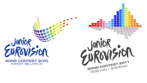
The theme artwork will look really familiar fans, as it looks like the JESC 2010 & JESC 2011 theme art mashed together.
 The theme artwork will be used everywhere from the TV graphics to clothing and other merchandise!
What do you think of the Eurovision Song Contest 2015 theme logo? Are you happy with it or were you expecting more? Comment down below!


Looks good. But reminds me of ESC 2010 and ESC 2011 logos
I much rather this to #JoinUs, although I LOVED the staging that we got from ”Wonderful Copenhagen”.
It’s fantastic! I like the slogan and the graphics. The only thing I don’t like is how they cleaned up the new Eurovision logo and heart. But I think they can do a lot of cool things with this design in the overall packaging. I hope they do something original with the postcards as well this year, as the past two years of “the artist doing something” is getting old real quick.
I love it, I absolutely LOVE it!!!!!!!!!!
Could they show the most famous bridge from each country in the intro clip to each? That would work real well with this.
Another thing I forgot to mention is that I love the simplicity behind this graphic design.
I absolutely LOVE this logo. It is brilliant. From this graphic design, I can actually see the formation of a really good stage in the Wiener Stadthalle in May.
I’m looking forward to upcoming developments from ORF and Austria.
I absolutely love it! As a 15 y/o Dutch student interested in the way logos are made to show its background I find this very appealing
ORF, why looking so cheap? When you have 30 million euros to spend (official numbers) in total, you just can’t come up with this kind of design. I don’t get the universal “yes” to this, and as a designer myself I think that this was probably in the back of my mind or to be honest – somewhere lost over there (in the back of my mind) as an idea. I don’t like the motto, don’t like the look. Yes, it looks like both of those JESC designs. Oh, I said it previously – DR (Denmark) should do some PR/brand… Read more »
Very good. It does sort of remind you of the logo for Düsseldorf 2011, no?
I love it. The asthetic theme is more warm and welcoming. The colour pallets of the last two have felt a bit cold. This will make a brighter and more colourful show. Fits the more flamboyant nature of the show especially as it was brought to the country by Conchita. For those complaining about it being unoriginal, have you seen howmany doves, flags and musical notes combinations occured during the sixties and seventies. This logo doesn’t ripoff others as much as old ones have. Anyway after 60 contests, there is going to be similar designs. Overall though, I think it… Read more »
Don’t like it.
and i love the logo! the white line around the circle kinda looks like a bridge
Why??- i know it’s very annoying but i think they are mostly from 1 person
It looks good.
Why all the comments on *every* article, saying vote for a country that hasn’t even selected it’s song/artist yet? Please, save your words.
Budapest or Tbilisi (I hope Georgia can show Europe that they can actually send a good song) 2016. Please don’t let Eric Saade win
Yerevan 2016
I LIKE THIS DONT GET ME WRONG
JESC 2010 + ESC 2010 + ESC 2011….
My idea was a “A Modern Classic” because Austria is home to classical music yet ESC is very modern and entering it’s 60th year (it is a “classic” TV program)…
I do like it, sure it’s more creative then a diamond or slapping three words on a butterfly, but I expected something more creative and amazing for the 60th show, not very new. I want a new show to kick off the new decade 😀 #BuildingBridges
I also think it looks like 2010 and 2011 mashed together. Poor show.
I like it. It’s modern and as Robyn pointed out, more abstract, which makes it open for interpretation from the viewer, it will mean something different for everyone and I think that’s important for a graphic identity, for it engages more with the audience. What I like the most of it, is that it feels more related to music than in previous years, something I was missing from years like 2006 or 2008. For me the dots don’t only remind me of people, they could also represent notes in a music sheet and/or a musical wave. Very fitting for the… Read more »
I expected a 60 years celebration-type of logo but it seems that they want to be as “authentic” as all of the logos from the previous years…
It’s so cheap… It’s ESC 2011 and 2010 mixed together.. It really looks like Saturn..
I totally love it 🙂
This looks a lot like Düsseldorf’s logo to me. It’s not a bad design, just not very original or creative. Seems like they didn’t have many ideas so they just threw this thing together.
awful.
Cheap… But it can worser
Bubbles again? To me it looks more like a combination between ESC 2010 and ESC 2011. Replace the 2011 heart with a 2010 bubble and you get 2015. I don’t know, I am underwhelmed. I expected something a little bit more creative to be honest.
It could have been worse, too. Thank goddess it’s not a bridge.
DO NOT VOTE FOR GOLOS WINNER’S DUET WITH RODNEY GILFRY (BOTH ARE REPRESENTING RUSSIA, BUT RODNEY’S FROM USA).
Eurovision 2015 logo BUILDING BRIDGES and winner Greece please Europe vote for Greece this year
MARAVILLOSO
I love the design!
Great job ORF!
Eurovision Song Contest 2015 winner Greece please Europe vote for Greece this year and Athens 2016
Wow the best we have had in a couple of years! It looks awesome!
reminds me of germany.
To me, the sphere looks like a part of a dynamic microphone!!! and those wave of orbs seem to be the sound waves!!! yeah, i have to agree, it kinda looks like the jesc 2010 logo!!!! i actually like it!!! it’s music-related!!! i’m feelin this one!!!